Supply and Demand Trading in 2026
We have been trading supply and demand strategies for over ten years, and they have stood the test of time remarkably well. Supply and demand is...

The MACD indicator is a popular momentum and trend-following indicator that is based on the information of moving averages and, thus, is ideal to act as an additional momentum tool and momentum filter for your trading.
In this article, we will explain what the MACD indicator does, how it helps you analyze the price, and how to use it in your own trading.
First, let’s take a look at the individual components of the MACD indicator:
MACD Line: The MACD line is the heart of the indicator. The MACD line is the difference between the 12-period EMA and the 26-period EMA. This means that the MACD line is a moving average crossover system.
Signal Line: The Signal line is the 9-period EMA of the MACD line. The Signal line is a moving average on a moving average, basically.
MACD Histogram: The histogram is the difference between the MACD line and the Signal line.
In this article, we focus on the MACD and the signal line in particular. The histogram is derived from the other two components of the MACD and, thus, doesn’t add as much explanatory value to overall MACD trading.
The MACD is based on moving averages ad this means that it’s ideal for analyzing momentum, finding trend-following entries, and staying in trends until momentum is dying off.
There are two MACD signals in particular that we will explore in this article and explain step by step how to use the MACD to find trades:
1) The MACD Line cross at 0
The screenshot below shows the MACD line and the Signal line at the bottom of the chart. I also plotted the two moving averages (12 and 26 EMA)on the charts.
This helps us understand the mechanism of the MACD right away:
When the two EMAs cross at the price chart, the MACD line crosses below 0 as well - I marked the cross with an x and a vertical line.
We can see that the MACD is identical to a regular moving average crossover system.
As we know from our moving averages article, a cross of two Moving Averages shows a change in momentum and it can often foreshadow the start of a new trend.
When the MACD Line crosses 0, it shows that momentum is changing and potentially a new trend might be starting.
2) The space between the MACD
When the two MACD indicator lines separate, it means that momentum is increasing and the trend is getting stronger.
When the two MACD lines are coming closer together, it shows that the price is losing strength.
Furthermore, we can use the 0-line as a trend tiebreaker. When the two MACD lines are above the 0-line, the price can be considered in an uptrend. And when the two MACD lines are below the 0-line, the price is in a downtrend.
During range periods, the two lines from your MACD are usually very close together and they hover around the 0-line; this means that there is no momentum and no strength in the market.
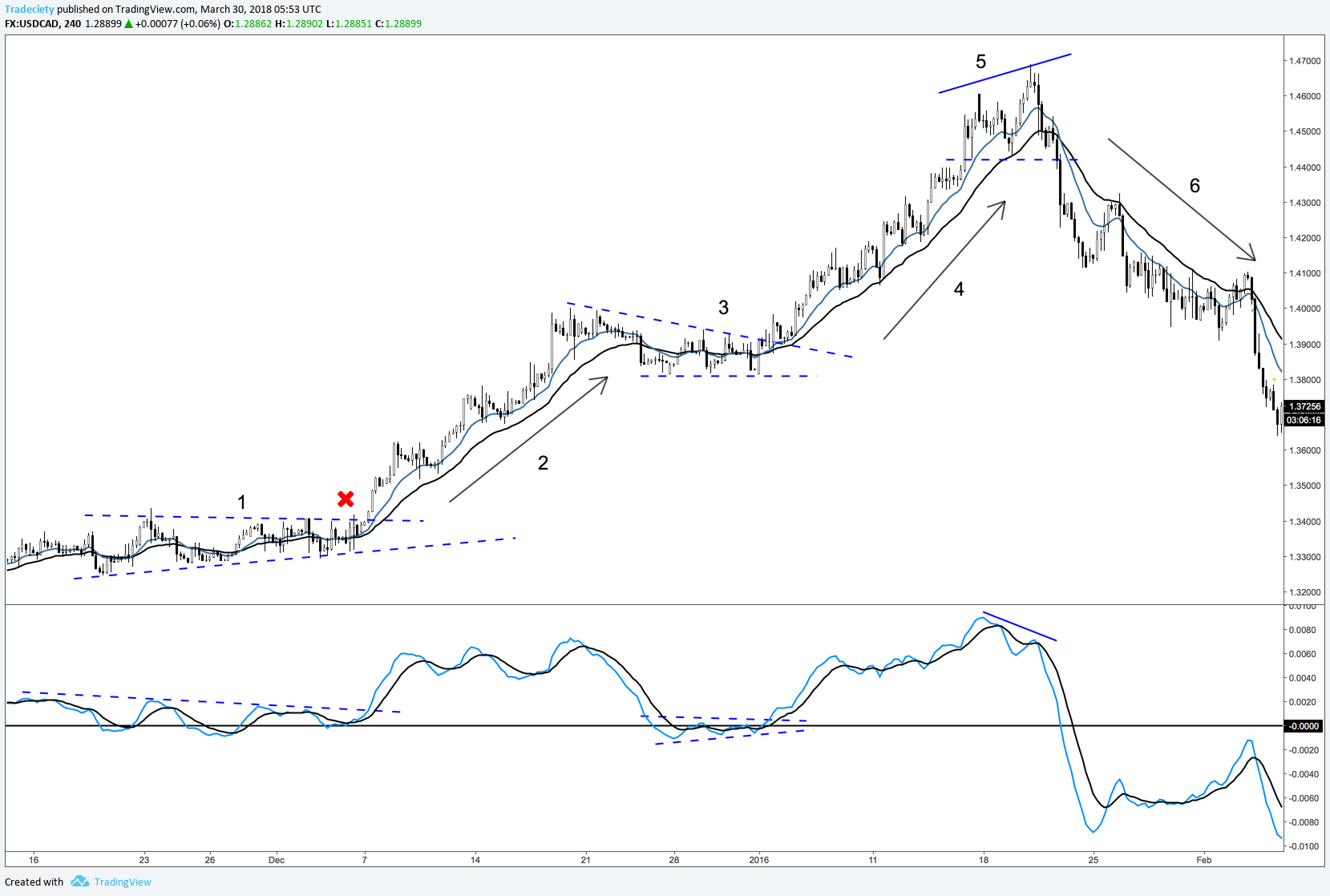
Let's take a look at the chart study below to understand how the MACD helps us understand the different market periods.
At point #1, the price traded in a narrow range while the MACD lines hovered closely around the 0-line and constantly crossed each other. When the price broke out, the two indicator lines pulled away from the 0-line and separated from each other.
You can also draw trendlines or support and resistance levels directly on your MACD indicator. A breakout of the MACD is another important momentum signal.
During the following trend, the MACD lines stayed well above the 0-line, confirming the overall bullish sentiment. The Moving Averages on the price chart can be a great add-on for a trend-following trading approach; they keep you in trends until the Moving Averages have been broken.
The price entered a sideways consolidation period at point #3. The MACD pulled back all the way to the 0-line during the consolidation. The breakout of the MACD lines and the price action led to the next trending phase.
During the trending phase (#4) the MACD stayed above the 0-line once again. As long as the MACD is above 0, the bullish trend is valid.
At the top (#5), the price made higher highs whereas the MACD made lower highs. This is a classic divergence signal. A divergence signals a loss in trend momentum and is a strong reversal pattern.
After the divergence, the price reversed strongly to the downside and the MACD fell below the 0-line for the first time. This started the new down-trending period with the MACD staying below 0 all the way.
MACD divergences are another great way to analyze the price and find early trend-following trades.
In the screenshot below, the market was in a strong uptrend initially. This led to a quickly rising MACD.
The momentum then changed and the price only moved higher very slowly and did not advance much. The MACD turned lower which signals the change in momentum.
When the price broke below the two moving averages with a strong selling period, the MACD also started breaking below the 0-line. Such a signal will often foreshadow more bearishness to come.
Indicators can be a great addition to your trading since they provide objective and easy-to-interpret information. Especially for trend traders, the MACD can be a helpful indicator because it analyzes trends and momentum effectively.
Another great indicator in this category is the STOCHASTIC indicator and you can read more about how it can help your trading: STOCHASTIC indicator

We have been trading supply and demand strategies for over ten years, and they have stood the test of time remarkably well. Supply and demand is...

3 min read
Choosing the right trading journal is essential for traders wanting to analyze performance, refine strategies, and improve consistency. In this...

3 min read
“95% of all traders fail” is the most commonly used trading related statistic around the internet. But no research paper exists that proves this...