Supply and Demand Trading in 2026
We have been trading supply and demand strategies for over ten years, and they have stood the test of time remarkably well. Supply and demand is...

Candlestick charts are further developed line charts – which the image below shows – that serve to compensate for the disadvantage of less information. Candlestick charts have their origin in 17thcentury Japan. Today, candlestick charts are the preferred tool of analysis for traders and most investors since they provide all the required information at a glance. In this article, you will learn everything you need to master candlesticks patterns like a true professional.
As the name suggests, a candlestick chart is made up of so-called (price) candlesticks. These candlesticks are made up of different components to describe the price movements of financial instruments.
Two sample candlesticks are shown below. A candlestick consists of a solid part, the body, and two thinner lines which are called candle wicks or candlestick shadows.
The candlesticks are color-coded to illustrate the direction of the price action movements. A white candlestick represents rising prices, whereas a black candlestick shows that the price fell during the period.
Figure: A rising candlestick is shown on the left and a falling candlestick is shown on the right along with the explanations of terms used for individual candlestick components.
The length of the shadows shows how much the price has moved up and down with respect to a candlestick within a specific duration. If we set our charts so that one candlestick corresponds to one day, then we can read the daily fluctuations in the financial market using the shadows of a candlestick.
The candlestick body describes the difference between the opening and closing prices for the corresponding time period.
The body of the white, rising candlestick below shows that the price opened at $10 and closed at $20 in the selected time interval, but has fluctuated between $25 and $5 in the meantime, as indicated by the shadows.
Figure: The trend of candlesticks from the opening price to the closing price is described by the candlestick body. The shadows show the entire fluctuation width.
If we line up several candlesticks, we can reproduce the progression of line charts by following the candlestick bodies as shown below. The candle shadows also show the severity of price fluctuations in each case. We, thus, get all the information that is essential for an effective price analysis at a glance. This is why candlestick charts are mostly used for technical analysis these days.
Figure: If you follow the path of the candlestick prices, you can reconstruct the line charts. Candlesticks offer more information and are the preferred medium for technical analysts.
Anyone who knows how to analyse and interpret the so-called candlestick patterns or candle formations, already understands the actions of the financial market players a little better.
Candlesticks can be divided into four elements, where each element reveals a different aspect of the current trading behavior and the prevailing market sentiment.
To understand the price and candlestick analysis, it helps if you imagine the price movements in financial markets as a battle between the buyers and the sellers. Buyers speculate that prices will increase and drive the price up through their trades and/or their buying interest. Sellers bet on falling prices and push the price down with their selling interest.
If one side is stronger than the other, the financial markets will see the following trends emerging:
It is always important to keep this in mind because any price analysis aims at comparing the strength ratio of the two sides to evaluate which market players are stronger and in which direction the price is, therefore, more likely to move.
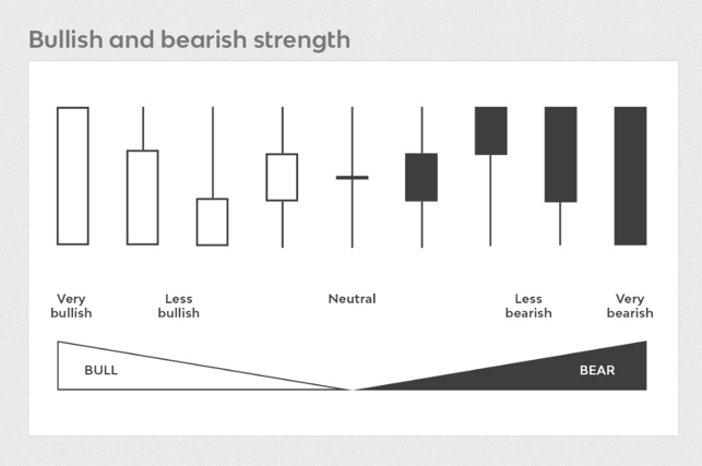
The size of the candlestick body shows the difference between the opening and closing price and it tells us a lot about the strength of buyers or sellers.
Below, the most important characteristics of the analysis of the candlestick body are listed.
Figure:Left: Long candlestick bodies during the downward and upward trend phases. Sideways phases are usually characterized by smaller bodies. Right: Rising candlesticks are stronger in the upward trend. At the peak, the ratio tilts and a sideways phase is characterized by smaller candlesticks.
The length of shadows helps in determining the volatility, i.e. the entire range of price fluctuations.
Characteristics of candlestick-shadow analysis:
For a better understanding of price movements and market behaviour, the first two elements must be correlated in the third element.
Important factors in this context are:
Figure: There are almost no shadows during the left rising phase, confirming the strong trend. Suddenly long candlestick shadows are visible in the sideways phase; these indicate uncertainty and an intensified battle between the buyers and the sellers. When candlestick shadows increase, it can foreshadow the end of a trend.
As far as the position of the candlestick body is concerned, we can distinguish between two scenarios in most cases:
Figure: From left to right: The size of the candlestick body describes the strength of the price movement. The longer the body, the stronger the impulse. If the candlestick shadows are longer, there is a balance between the sellers and the buyers and the indecision increases.
Now that we have covered the individual elements, we can put things together and see how we can use our knowledge to dissect price charts.
Let’s follow price in the chart below and I share what we are seeing here in the candlesticks:
Below we see a typical range behavior and we can see how the candles tell us what is going on:
In the final example, we can see a classic pattern at the end of a trend. This is also often one of the building blocks to the trading strategy which you can learn in our pro area.
With this article we want to show you that you do not have to remember any candlestick formation to understand price. Quite the opposite. It’s very important on your path to becoming a professional and profitable trader that you start thinking outside the box and avoid the common beginner mistakes. Learn how to understand how buyers and sellers push price, who is in control and who is losing control.

We have been trading supply and demand strategies for over ten years, and they have stood the test of time remarkably well. Supply and demand is...

3 min read
Choosing the right trading journal is essential for traders wanting to analyze performance, refine strategies, and improve consistency. In this...

3 min read
“95% of all traders fail” is the most commonly used trading related statistic around the internet. But no research paper exists that proves this...