Supply and Demand Trading in 2026
We have been trading supply and demand strategies for over ten years, and they have stood the test of time remarkably well. Supply and demand is...

I am a big believer in chart patterns and there are a few patterns that can produce very reliable signals. However, it’s never about the patterns themselves, but what those chart patterns tell you about the market dynamics and how traders move price.
In this article, I want to explain how to “decode” any chart pattern so that you will be able to understand price movements in a much better way. In the second part, we will take a look at the 4 best chart patterns and how you can use them to make better trading decisions.
And if you find this way of trading interesting, our trading courses also make use of the principles of advanced chart reading and much more.
All chart patterns, whether it’s the Head and Shoulders pattern, triangles, wedges, pennants or the Cup and Handle, are made up of the 3 same components. If you understand how to read those 3 components, you can make much better trading decisions and understand price in a new way.
Although it sounds very basic, the analysis of how highs and lows form on your charts build the foundation of any chart pattern analysis. We will get into the nitty gritty soon, but all future chart analysis is based on understanding highs and lows.
It also builds the foundation of the Dow Theory which has been around for decades and is a time-tested trading principle.
Uptrends: Higher highs and higher lows
A trend can only exist if the highs and the lows rise. The rising highs show that the buyers are able to push price higher. The rising lows show that during the correction-phase, the sellers are not able to build a significant opposition and the buyers step in time and again to counter the correction-phase and continue the uptrend.
A trend change
When you see that price fails to make a new high, it can serve as an early warning signal that a change in direction is imminent. Or, when the price barely able to make a new high it can also foreshadow a potential turning point of the buyer and seller balance.
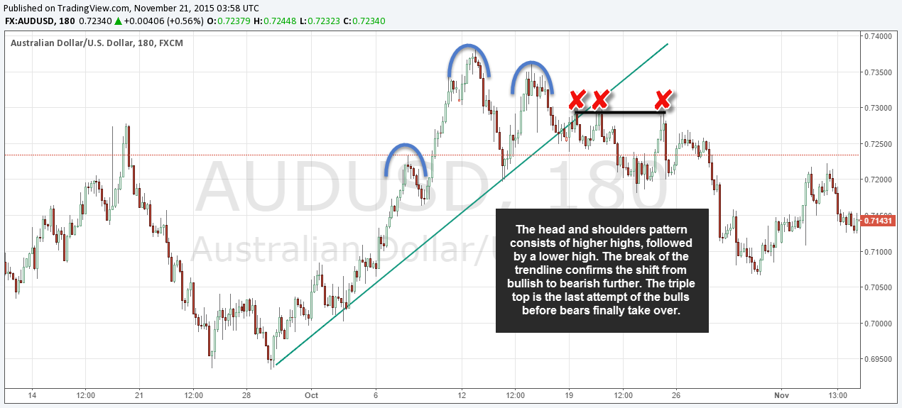
The screenshot below provides a preview and this Head and Shoulder pattern shows that from the left shoulder to the head, the price barely made a new high, indicating that the buyers were not very strong anymore. The right shoulder further confirms it and makes a lower low and signals that the sellers are gaining more strength.
The strength of a trend is defined by the individual trend waves that exist between the highs and lows. Here, you should specifically look at the length/size and the steepness of those individual trend waves to get a feeling for trend strength.
Most conventional chart analysis only focuses on the highs and lows themselves, but an important part is understanding what happens between the highs and lows.
In the screenshot below you can see that the first trend-wave (first black arrow) was very steep and long. The second wave was less steep and shorter in duration. The final third trend wave was much shorter and also just barely broke the previous high – we also saw more price wicks which are another rejection and exhaustion signal. Putting all the clues together, the reversal could have been anticipated by understanding the concepts of trend-wave length and steepness.
Once you have identified that price is in a trend, the pullbacks within that trend can provide valuable information about what might happen next.
The screenshot below shows an uptrend with many consolidations and retracements in between. However, just before price reversed into a downtrend, the final retracement was much larger in size and duration, showing that something had changed in buyer-seller sentiment and balance.
Whereas a short and shallow retracement means that the ongoing trend is still intact, when retracements become more frequent and larger in size, it can foreshadow a potential trend shift as buyer and seller balance is slowly shifting.
Usually, chart patterns are not that clear-cut and far from the textbook examples that you’ll usually find in trading literature or on other trading websites. Thus, it is even more important to understand how to decode chart patterns to make the right trading decisions.
We will now take a look at the 4 most commonly traded and discussed chart patterns and see how our previous 3 principles apply to each one.
A triangle shows a temporary period of consolidation within a trend or at the beginning of a new trend. During an uptrend, a triangle is formed when the retracements and pullbacks become smaller and smaller; buyers step in earlier each time to push the price back up. Triangles are much more reliable during established trends as they signal accumulation of positions before the next trend continuation.
Further reading: Our detailed guide on how to trade triangles.
A Head and Shoulders pattern signals a potential reversal and by decoding the individual parts of this chart pattern you’ll quickly see how this pattern describes sentiment shifts nicely:
From the left shoulder to the head, the price makes a higher high. Often, the left shoulder forms after an ongoing trend and the head is then usually just the last push. Then, the right shoulder fails to make a new high which is the first indication that the trend might be over. The break of the neckline then signals that price is going to make a lower low, confirming the trend reversal.
Being able to interpret highs and lows is all you need when it comes to reading the Head and Shoulders pattern.
Double tops and double bottoms are reversal patterns as well and, similar to the Head and Shoulders pattern, the reasons and underlying dynamics are the same:
The second top, which fails to break the first high, signals that there are not enough buyers to push price higher anymore. Therefore, when you see a double top or double bottom it often signals a shift in price dynamics. If the double top is then followed by a break lower and new lows, the trend shift is confirmed.
The Cup and Handle pattern is also just a series of highs and lows; the Cup and Handle formation below shows a slow transition from a downtrend into a new uptrend. First, you see a series of lower lows, followed by a consolidation at the bottom of the Cup and, finally, price starts making higher highs. When then price breaks the top of the Cup, the uptrend is confirmed. A potential Cup and Handle that does not break the previous highs become a double top pattern.
As you can see, you can understand and decode all major chart patterns by looking at how highs and lows form, how steep and long trend waves are and how deep retracements are. This knowledge also enables you to estimate the quality of chart patterns and it will help improve your chart reading abilities as well.
Let’s recap what we have learned about the building blocks of chart pattern analysis:
(1) Highs and lows build the foundation of all chart analysis
(2) The first shift in sentiment occurs once price stops making higher highs or lower lows
(3) The length and the steepness of trend-waves define the overall trend strength
(4) The depth of retracement in between trend waves tells you a lot about the balance between buyers and sellers

We have been trading supply and demand strategies for over ten years, and they have stood the test of time remarkably well. Supply and demand is...

3 min read
Choosing the right trading journal is essential for traders wanting to analyze performance, refine strategies, and improve consistency. In this...

3 min read
“95% of all traders fail” is the most commonly used trading related statistic around the internet. But no research paper exists that proves this...