Supply and Demand Trading in 2026
We have been trading supply and demand strategies for over ten years, and they have stood the test of time remarkably well. Supply and demand is...

I’d like to begin this article with a question:
Looking at Charts A and B below, which one would you say shows a strong uptrend that you think would sustain itself in the future?
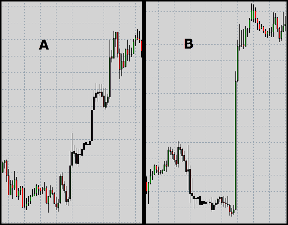
Chart B, right? Well, we have got an obvious indication of strength, given hardly any pullbacks during the move and just big bold bullish bars marking their authority on the chart. I am here to present an alternate viewpoint that might just challenge your answer.
Let’s break down the backstory behind the price action in Chart B, to get things going…
No one would argue that Chart B represents strong bullish price action judging simply by the steep move up that price made. But in essence we basically had one of the two aspects at play here:
Superficially speaking, both the options look like they refer to the same thing, and yes that is 100% true. In either of the cases we have more buyers than sellers and that is why price made that sharp move up.
However, in times when the broader context on the chart reveals which one of the two dynamics could be at play, you can literally know hands-on what such moves in the market signify and what they are trying to do.
In a rapidly moving market, this bit of information is gold regardless of whether you’re lining up a trade entry, already managing one or are sipping coffee and enjoying the action from the stands.
Consider a market in equilibrium where we have 50 buyers and 50 sellers at a particular price point (with equal amount of orders). Price will have absolutely no need to move at all hence the equilibrium. Now consider price moves sharply to the upside.
Situation one would entail there are now a 100 buyers and 50 sellers, while situation two would require that there are 50 buyers and 25 sellers. In both the situations we have more buyers than sellers and the result hence is the same (price moving sharply up), but you’ll see in a moment why more buyers coming in to the market is actually not the same as sellers withdrawing from the market.
As price action traders relying majorly on technical analysis, we are told to always look out for key support and resistance zones. They could be defined as roughly eyeballed zones where bar highs and lows and interact, or a specific area on the chart where we have a host of factors pile up (trend lines, round numbers, Fibonacci and MAs etc etc).
Arguably, these zones are perhaps the most important when it comes to orderflow trading which in itself is really just trying to align your entries and trades with money flowing from large funds and institutions.
As you will see shortly, identifying these zones in the market makes up an extremely crucial aspect of analyzing where a trend is headed.
We are now directly addressing the question I asked in the beginning of the article. So then, Chart A or B?
Well, before you even attempt it (or re-attempt it) take a quick visit to your charts and scroll left stopping briefly every time you see a sharp move in one direction. Simply note the number of times price actually reversed that entire move very shortly afterward. Surprised?
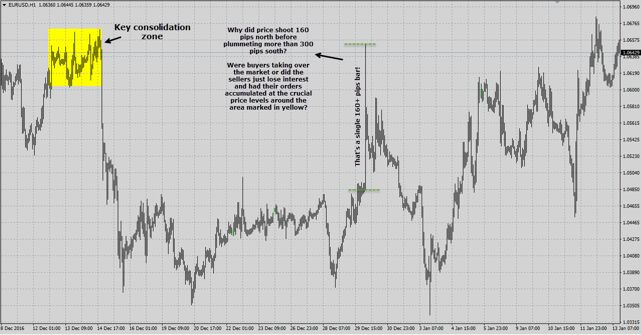
Here is a chart for reference:
Why is price doing that? If buyers took sudden authoritative control over proceedings why did the bears take over almost every time? This question will really only come from the person who has always thought of an up move as an influx of buyers only. That is, the person has never considered the second alternate possibility that the move up may also be as a result of sellers temporarily withdrawing.
In a situation when one party rapidly withdraws from the market (or is completely overpowered) we have what we call “liquidity disequilibrium”. Recall that ‘liquidity’ is simply the ease with which buyers can find sellers and vice versa at a particular price point.
If there are not enough buyers to buy from the sellers or when there are not enough sellers from whom buyers want to buy from….we end up in liquidity disequilibrium. On the chart, this will either be printed as a gap or an extremely sharp move in price.
Importantly, depending on the context and the overall location, this sharp move may not exactly be an indication of strength. In fact, in certain situations it could be a sign of impending weakness, as you may have guessed by the number of times you saw price reversing on sharp moves.
So why would one party suddenly withdraw from the market only to take control shortly after?
It is not a coincidence that you will often see price racing towards a key zone. If I may….actually, the faster price accelerates into a key support and resistance zone, the more the chances that it will likely rebound. A lot will depend on the strength of the zone itself and how conspicuous it is.
It is only logical to assume, that since most traders are eyeing certain areas on the chart, that they would want price to hit those areas for them to get interested in clicking their order buttons.
Same chart…more examples:
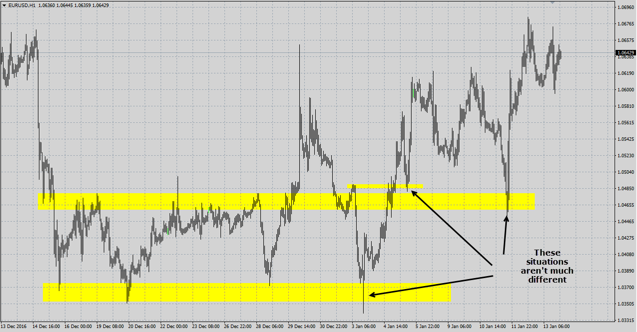
At this point, it should be clear why price behaves around key zones the way it does.
Let’s revert back to our original question then…Chart A or Chart B? At this point, an intelligent answer would be ‘it cannot be concluded based on the information we have’. As you can see the question / charts tells you nothing about the surrounding location of the trends and the existence of any key zones nearby, if at all. And that really is the crux of it all.
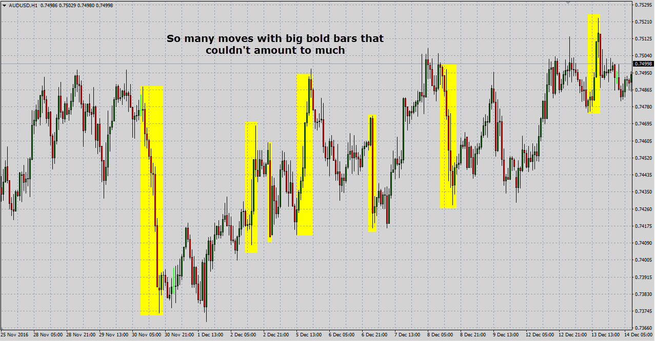
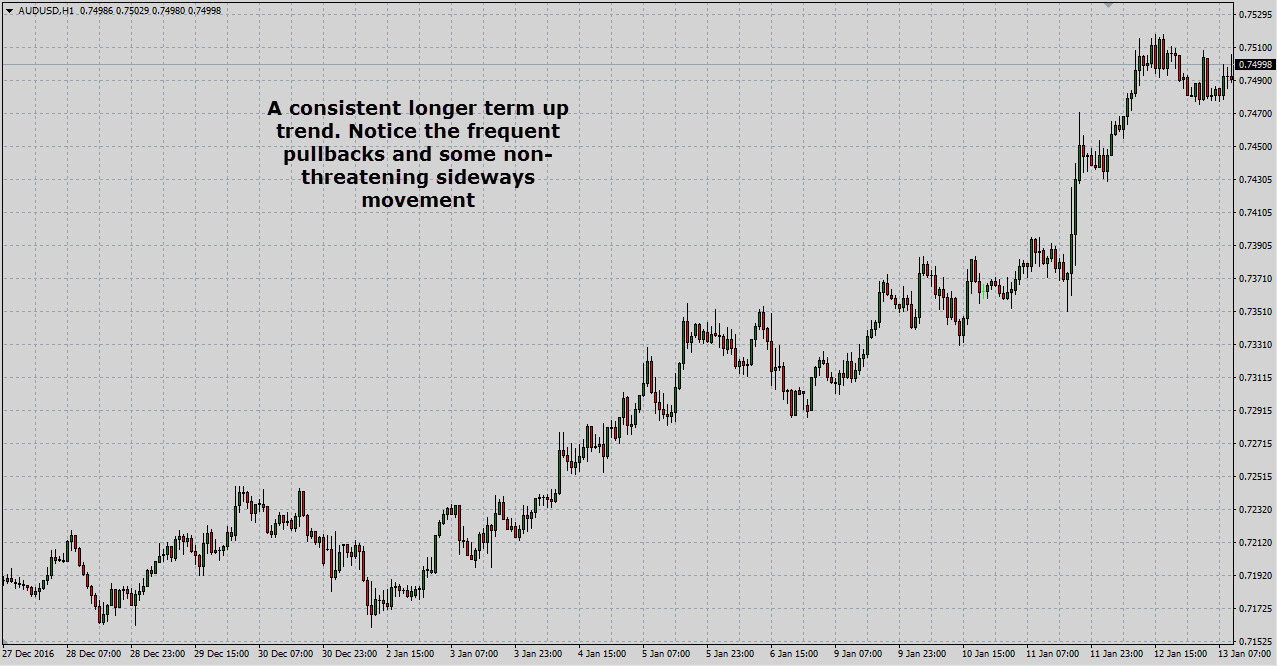
Before you run away with this trying to short every sharp move up, it is important to understand that price action queues work in tandem with key support and resistance zones for high probability setups. But generally speaking a healthy longer term trend will usually be made up of frequent but brief pullbacks that allow for a consistent flow of buy orders as well as the absorption of persistent sell side activity, kind of like what we have on the AUD/USD on the 1H chart these days:
Take note that what we are talking about here is really just general market dynamics. You will find several random situations where you have the liquidity equilibrium dynamics play out, without the existence of a strong zone.
You will also have situations where price literally caresses a key zone and smooches it several times before rebounding off of it. As traders we are really just looking to group several factors to find our A grade setups rather than try and explain every bit of the market movement all the time.
Next time you see price accelerating into a major resistance zone, maybe you’ll just smile instead of clicking the Buy button seeing a bullish engulfing bar pattern.
external link:

We have been trading supply and demand strategies for over ten years, and they have stood the test of time remarkably well. Supply and demand is...
3 min read
Choosing the right trading journal is essential for traders wanting to analyze performance, refine strategies, and improve consistency. In this...
3 min read
“95% of all traders fail” is the most commonly used trading related statistic around the internet. But no research paper exists that proves this...