Supply and Demand Trading in 2026
We have been trading supply and demand strategies for over ten years, and they have stood the test of time remarkably well. Supply and demand is...
Imagine having to manage an employee who was given the task of completing a specific project.
Depending on the type of manager you are, you might answer in one of the following ways.
This analogy is a very human scenario, of course; one that might have certain moral or ethical implications. But in the realm of price movement, the difference between process and result can be a bit more calculated.
One question this scenario brings to the fore: At what point does detail become noise?
Take a look at the candlestick chart below.
There are plenty of potential breakout points, too many perhaps. Taking a look at the price action inside the green rectangle, let’s suppose (and this is what really did happen) that reports concerning the company’s dealings may have resulted in conflicting interpretations among traders and investors, resulting in a noisy process of volatile indecision.
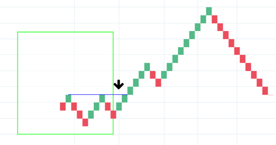
But what if we were to just measure results based increments of closing price movements, say, $1 increments? We get the following:
In this Renko chart, the highs and lows are eliminated. Time is eliminated. What’s left is a mapping of price movements by $1 increments (or “bricks”). So where did all that volatility go? It has been filtered, flattened, phased out. Any price movements besides closing up or down by a specified quantity (in this case, dollar increments) were removed from the chart. The brick movements comprise the substance.
Filtered through a renko chart, what you get is a clear breakout (see arrow) from what might have appeared in the candlestick chart as a volatile zone of pure noise.
Now that you can see how renko charts can help simplify the price landscape and filter out market noise, let’s take a step back and cover some basic ground, especially for those of you who are not familiar with this form of charting.
Understanding Box Sizes or “Bricks”
Imagine the following price scenario: an asset opens at the price of $10.00, hits a low of $8.00, breaks as high as $11.75, and closes at $10.50.
A candlestick chart, which details the open, high, low, and close would represent the price movements in this manner:
Note the opening and closing prices in the body, and the upper and lower wicks denoting the highs and lows.
A renko chart would represent things much more minimally.
First, note the following:
So in a renko chart with an $0.50 box size, the charts above would appear like this:
Note that the renko brick shows the opening price to be at $10.00. The highs and lows are not present in the chart.
But if the asset closed at $10.75, why is it showing a closing price of $10.50? The answer is that the box size has been set to $0.50 increments. If price closed at $10.49, then there would be no brick. If price closes anywhere between $10.50 and $10.99, then there would only be the one brick shown above.
Now, if price closed at or above $11.00, then you would see this: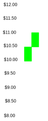
And let’s suppose that price really skyrocketed and closed at $12.30. This is what the chart would look like:
Do you get it now? It’s about closing prices at full 50-cent increments.
Understanding the Compression of Time Into Price
Take a look at the hypothetical line chart below representing the rise and fall of an asset’s price over a year’s duration. In January, the asset opened at 65.00, fell to 59.00 on April, it a high of around 78.00 in October, and fell back down to below 63.00 by November.
Now, let’s suppose you were interested in the broader strokes, more specifically, tracking this asset by box sizes of 5.00. If you set your box size in this manner, then your renko chart might appear similar to the one below.
Note that only the significant 5.00 movements are represented, occurring in April, August, September, and November–compressing an entire year’s worth of price action to four renko bricks.
Toward the end of 2018, indices across the globe, particularly in the U.S. were undergoing major declines, spurred by fears of a potential U.S. recession, slowdown of global economic growth, an escalating trade war between the U.S. and China (as well as the EU and possibly Mexico) and an inverting yield curve in U.S. Treasury bonds.
The U.S. Federal Reserve had also been hiking interest rates to shed trillions worth of assets from its balance sheet. This strengthened the dollar, as emerging market investment continued flooding money into dollar-denominated assets for safety.
In early 2019, amid the Fed’s slashing and President Trump’s twitter protests, the Fed will have announced a halt in rate hikes. In addition to this, Trump and China’s Xi will have decided on a March deadline to come up with a trade deal, relieving the market of at least two fears that had been plaguing it toward the end of 2018.
But signs of these potential fundamental changes may have already been evident in the gold market, however speculative they were. Technically savvy traders might have seen this in the price action between July and November of 2018.
But finding a clear bullish entry point might have been a bit tricky:
Might it have been easier to just zoom out and buy a breakout of a 10-point renko brick as shown in the arrow below?
The dip following the upside breakout might have been tricky. From a technical point of view, it’s only a 38.2% Fib retracement from the September low. From a fundamental perspective, you had to factor in the rumors that the U.S. Fed was thinking about taking a 180-degree about face, not just halting interest rate hikes but even “lowering” interest rates again–news that was made public on Friday, June 7, 2019. Hence, U.S. indices rallying, and gold breaking above its most recent highs, as a slash in the Fed funds rate has a potentially weakening effect on the dollar.
If your trading strategy feeds off detailed short-term data, then candlesticks might be the way to go. If you need to see the bigger picture, then perhaps a renko chart might work best for you.
The biggest caveat when using renko charts is that you cannot see the highs or lows. If you hold a highly leveraged position, say on the long side, and if your asset’s price dips low before closing, then you run the risk of getting stopped out. Likewise, if you plan to buy a brick that breaks out of a resistance area, then you might miss the opportunity if price skyrockets way above resistance.
Renko charts are somewhat lagging since you have to wait until the end of day to see where it stands. But in exchange for this delay, you get the convenience of seeing the bigger picture minus the noisy process.
We have been trading supply and demand strategies for over ten years, and they have stood the test of time remarkably well. Supply and demand is...
3 min read
Choosing the right trading journal is essential for traders wanting to analyze performance, refine strategies, and improve consistency. In this...
3 min read
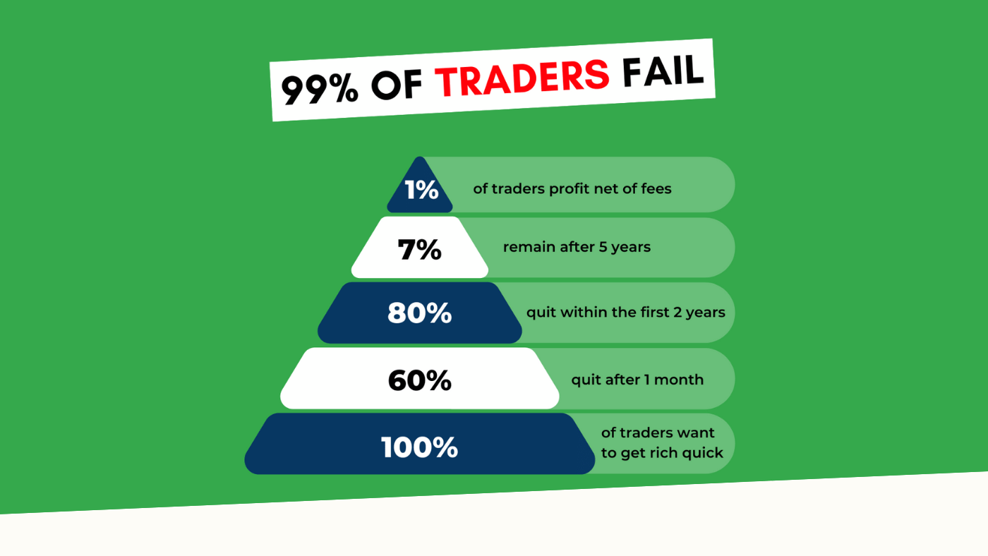
“95% of all traders fail” is the most commonly used trading related statistic around the internet. But no research paper exists that proves this...