Supply and Demand Trading in 2026
We have been trading supply and demand strategies for over ten years, and they have stood the test of time remarkably well. Supply and demand is...

The ADX indicator is a popular trend indicator and it provides information about momentum and trend strength. In this article, we will dissect the individual components of the ADX and explore step by step how to use them to make sense of charts and find trading opportunities.
As you will probably know, the ADX indicator comes with 3 lines: the general ADX line (the black line in our examples) and the two DI lines (green and red lines). We will first look at the ADX line.
Essentially, the ADX line measures trend strength and a rising ADX means that the trend is gaining strength, a falling ADX shows a trend that is losing momentum or reversing and a flat ADX shows a sideways range.
What is also important to know is that the ADX is non-directional which means that it does not give any information about the direction of the trend. When the ADX goes up, all it means is that the trend is gaining strength – this can then signal both a bullish or bearish trend. The two screenshots below show this nicely and the ADX rises both during the uptrend (first screenshot) and during the downtrend (second screenshot).
Finally, we must talk about the threshold level of the ADX. As you can see in the screenshots below, we plotted a vertical line at the ADX window at the 20.00 level. The 20.00 level acts as a tiebreaker: if the ADX is below the 20.00 level, price is in a range or in a very weak trend and only when the ADX breaks above the 20.00 level, it signals a strong trend that is likely to continue. In the screenshot below we marked the first time the ADX breaks above the 20.00 level and then when the ADX broke back below the 20.00 level and signaled that price has lost the momentum.
The second part of the ADX indicator are the two DI lines which are usually color-coded (red and green in our example). The DI lines provide directional information and they also measure trend strength.
Before we get into chart analysis, it’s important to understand how those green and red DI graphs are calculated – but don’t worry, we’ll keep it simple. The only thing you should remember is that the DI lines compare the absolute candle highs and the absolute lows of candles. Here are a few scenarios:
On the screenshot below, we set the DI period setting to 1 which means that the indicator just compares the two most recent candles. This is a good way of understanding the DI calculations quickly. Keep in mind, the DI just looks at the absolute high and the low (not the candle body).
When the DI lines cross each other, they give a signal; when the green line crosses above the red line, it means that the highs and lows of the previous candles are both moving higher which confirms an uptrend. When the red DI line crosses above the green DI line, it shows that over the past candles, price has been moving down and the lows and highs are going lower.
In the screenshot below we can see this nicely. First, the ADX line crosses above 20 (first black vertical line) but at this point, price was in a range. Then, things turned around and the green line broke above the red DI line and the ADX started to pick up again. The uptrend then gained momentum as the ADX was pointing up and the green DI line stayed above the red DI line. Once the red DI line crossed above the green line, the trend was over (red vertical line).
You can see, the first ADX cross didn’t provide a strong signal but on the second one, when the ADX started pointing upwards and the DI lines crossed simultaneously, it signaled a strong trend.
Now let’s connect all the dots and look at two markets and explore how the ADX indicator can help you to make sense out of these charts.
In the AUD/NZD chart, there were 5 ADX signals and we marked each with a vertical line and an arrow indicating the direction of the signal.
You can see that the first signal came a bit late and the ADX crossed 20 once price had been rallying already and at that point, the DI lines were very wide apart already; ADX signals are usually stronger when the DI crossover and the ADX 20-line-break happen at the same time (or relatively close).
The following signals would have given better entry opportunities but you can see that it’s important to have an effective profit taking and/or trailing stop method because not all signals will provide entries into long trend-following trades. As with every system, you have to learn how to maximize winners and cut losses and small profits effectively.
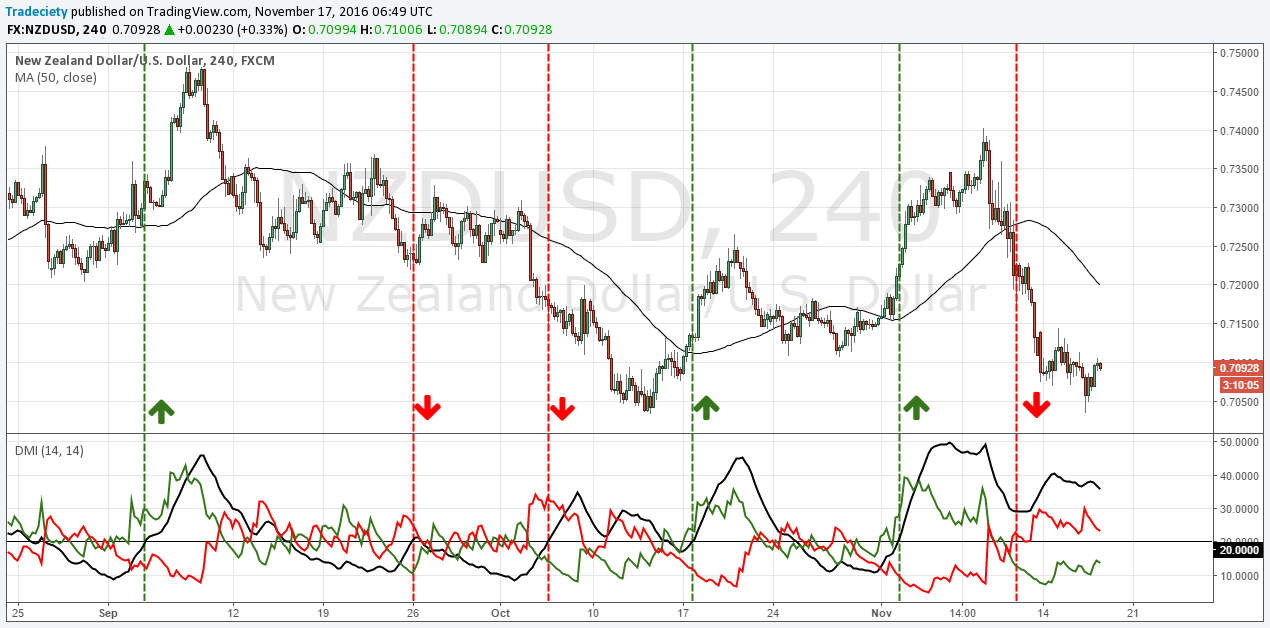
The NZD/USD chart shows 6 different signals and we will go through them one by one:
1) Relatively early long entry into a decent rally. Once the ADX hooked and turned down, price also started to reverse – the “ADX hook” is a good exit signal.
2) The ADX broke above 20 and gave a short signal but price immediately turned around and went back below 20. In such a scenario, a trader must be fast with cutting his loss.
3) A good short signal into a decent bearish trend. Staying in the trade would have been the real challenge here as the ADX showed the hook and then kept on trading lower.
4) An early long entry just as price broke above the moving average with good profit potential.
5) Very good long signal into a strong bullish market phase.
6) Another good short opportunity into a strong downtrend. The ADX hooked once price stopped its fall and entered the consolidation.
As you can see, the ADX indicator, just like any other indicator, does not provide 100% accurate signals but a trader who can find ways how to maximize the profitable opportunities while managing the failed signals can probably make good use of the ADX indicator.
Let’s recap what we have learned about the ADX:

We have been trading supply and demand strategies for over ten years, and they have stood the test of time remarkably well. Supply and demand is...

3 min read
Choosing the right trading journal is essential for traders wanting to analyze performance, refine strategies, and improve consistency. In this...

3 min read
“95% of all traders fail” is the most commonly used trading related statistic around the internet. But no research paper exists that proves this...