Supply and Demand Trading in 2026
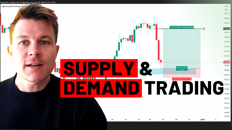
We have been trading supply and demand strategies for over ten years, and they have stood the test of time remarkably well. Supply and demand is...

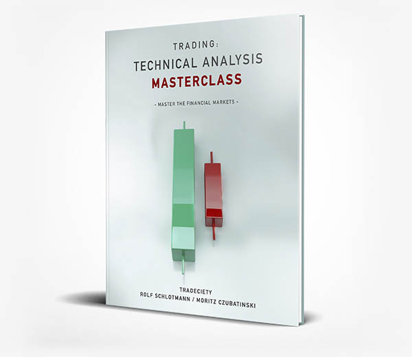
You have probably seen that our first book is out on Amazon and the feedback so far is overwhelming. Thank you for that!
I want to talk a bit about the idea behind the book and why I decided to write the book in this particular way. A few people said to me that they feel the book is too simple, but the majority appreciates the simplicity and understands why simplicity is needed.
In fact, once you understand the approach that takes complex things and breaks it down into the smallest possible components, you can master anything.
I recently listened to an amazing podcast with Steven Kerr who is the head coach of the Warriors NBA team. He also said that players like Stephen Curry practice the most basic skills such as dribbling and shooting every day, hours on end. He might already be the best shooter in the whole NBA, but at the end of each practice session he still stays for hours and works on his shooting.
When you read biographies like the one from Michael Jordan, Andre Agassi or Arnold Schwarzenegger – which I all highly recommend – you will see the same pattern. The best in the world work on their foundational skills more than anyone else. They don’t get caught up in fancy dribbling skills or the nitty-gritty, they always come back to the basics.
In trading, such an approach can be beneficial as well. It is very easy to get lost in the world of fancy indicators, trying each new price action secret strategy, wasting hours on fine-tuning each strategy parameter and worrying about each little detail. However, this is usually not what will make a difference in the overall performance. A trader would be much better off if he/she would spend more time on the foundational skills: really learning how to read a chart, journaling his trades, working on emotional impulses, letting winners run and cutting losses, controlling risk management and avoiding the gamblers-mindset.
If traders are honest with themselves, those things would probably have a much bigger impact on their performance, than getting lost in the nitty-gritty.
“Any intelligent fool can make things bigger, more complex, and more violent.
It takes a touch of genius— and a lot of courage — to move in the opposite direction.”
– Einstein
Our book has the goal to show traders a way to approach chart reading from a new angle. Template-thinking must be avoided and a trader needs to look beyond the regular chart patterns to fully understand what a market is telling him/her.
click: Get it on Amazon
When we break down complex patterns into their individual building blocks, we can understand any chart situation.
Each chart pattern can be broken down into individual trend analysis. Each trend consists of individual waves. Waves can be broken down into candlesticks and each candlestick consists of even more detailed information.
Here, for example, we can see an engulfing pattern on the left Daily-chart. The middle 4-hour chart shows the same information with a little more details and the right 1-hour chart shows that the engulfing on the Daily-chart is actually a Head-and-Shoulders on the 1-hour chart.
Another example is trend analysis based on highs and lows. Some people may find it too simplistic, but a trader who understands that highs and lows are essentially the fingerprints of the market participants fighting a daily battle will appreciate such an approach.
During trending markets, the price will generally make higher highs and higher lows. This is the only way a trend can move higher. Once this behavior is broken and the buyers cannot push the price into new highs, technical traders must pay close attention. The price is then so high that the previous buyers don’t want to buy any more (maybe even take profit and sell) and the price is now high enough for the sellers to get involved. When a market then starts making lower highs and lower lows, the trend dynamic has shifted towards a downtrend.
Of course, we can take this even one step further. Besides regular highs and lows, we must also look at HOW those highs and lows form. We do not have to make it too complex and looking at the chart below we can see the following:
As you can see, trend analysis then becomes relatively simple and suddenly price analysis makes sense when you see it through the eyes of the buyers vs. the sellers.
The beauty of this approach is that it does not take long until you can understand any chart situation. During the book, I explain Head-and-Shoulders, wedges, triangles, the cup-and-handle, ranges, and many more chart patterns. Each chart pattern is, thereby, broken down into its individual building blocks so that the chart analysis instantly makes sense. Furthermore, the reader can then trade chart patterns even if they don’t look like textbook patterns because he/she now knows how to read price action beyond what is usually taught.
Let’s think about what a head-and-shoulders formation really tells us: The price started in a downtrend where the price made lower lows and lower highs. However, the trend wave from the left shoulder to the head was barely able to make a new low. This already tells us that the sellers were not in total control anymore. Then, the price broke into a new high and the right shoulder indicates that the price even made a higher low. Those points clearly indicate a change in the buyer-seller balance. An uptrend is then what followed.
During the book, you learn how to read any chart pattern, even if it does not look like a textbook pattern. The price on the international financial markets is dynamic and no two patterns will look alike. That is why this approach is so helpful.
Take the head-and-shoulders below. The left shoulder already signals that the uptrend is not very strong because the price spent a lot of time ranging here. The bulls weren’t able to move price higher as easily. Then the trend wave to the head is very short too and the price indeed had a hard time making a new high. The right shoulder is the key as it shows that the buyers have lost interest and aren’t able to move the price upwards. The right shoulder only shows one last and very weak attempt to move the price higher.
The sellers are now in control and the downtrend was indicated by all the individual clues before.
And we can even look deeper inside how trends move. Candle size and the ratio between candlestick wicks vs candlestick bodies also tell us a lot about the microstructure between buyers and sellers.
During trending phases, the candlesticks usually have small or no wicks at all. Also, the body size is usually larger, compared to the end of a trend or range markets. Why? Because during sustainable trends, one side of the market participants holds the majority and can move the price in the trend direction easily. The stronger one side of market participants (bulls or bears) dominates the market, the faster the candles will generally move and the smaller the wicks are. We can observe that during the trending phases below.
Also, the distribution between the bullish and the bearish candles is very one-sided. We can clearly see how trends are dominated by either bearish candles during downtrends or bullish candles during uptrends. A change in this ratio tells us immediately that the market opposition is increasing.
When the trends slow down, the candle size usually decreases and the size of the candlestick wicks increases. This happens because the balance between the buyers and the sellers is not as one-sided anymore and both sides now actively “fight” about the control. The screenshot below shows how this plays out during the end of a trend.
As you can see, price action doesn’t have to be too complicated. If a trader knows how to break down complex situations into the individual building blocks, any chart situation can be interpreted immediately.
During the book, we will take this even further and look at dozens of chart studies, chart patterns and even cover the most popular indicators and how to apply them in the right context.
Whether you are a beginning trader or already have some knowledge, our book will surely provide you with a different view on how to look at price charts.
click: Get it on Amazon

We have been trading supply and demand strategies for over ten years, and they have stood the test of time remarkably well. Supply and demand is...

3 min read
Choosing the right trading journal is essential for traders wanting to analyze performance, refine strategies, and improve consistency. In this...

3 min read
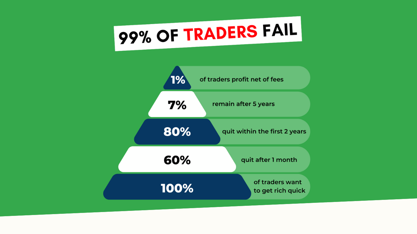
“95% of all traders fail” is the most commonly used trading related statistic around the internet. But no research paper exists that proves this...