Supply and Demand Trading in 2026
We have been trading supply and demand strategies for over ten years, and they have stood the test of time remarkably well. Supply and demand is...
Supply and demand zones can often indicate institutional buying and selling. The big market participants cannot just enter one trade at once, but they need to slowly build their position over time. And often their positions are so large that they will absorb all interest which then leads to big and explosive moves on our charts.
With the knowledge of supply and demand zones we can often identify those areas because the big players leave clues on our charts.
The scenario below is something we all have seen hundreds of times. It shows the classic price behavior around a support level. Common trading wisdom tells you that with each touch of a price level, the support area becomes stronger. This couldn’t be further from the truth.
What makes the price go down is an imbalance between buyers and sellers and there is more selling activity than buying going on. Each time the price reaches the support level, buyers enter the market and cause a bounce by outnumbering the sellers. Then, the price rises until sellers become interested again, outnumber the buyers and drive the price down. Although this is a very simplistic view, it explains how markets move.
But each time the price makes it to the support level, there will be fewer buyers waiting because, at one point, all buyers who were interested in buying have executed their trades. This is called order absorption. The screenshot shows that price bounced less high with each “touch” and eventually it broke the support level once there were no more buyers left and only the absorbing sellers remained.
When everyone has bought and when there are no buyers left, the support level will break and price falls until it reaches a price level where buyers will get interested again.
Think of order absorption around a price level like a ball that bounces off the floor. Each time the ball hits the ground, some of the energy is absorbed by the floor. Thus, each consecutive bounce will be lower than the previous one until all energy is gone and the ball comes to a standstill.
Although support and resistance levels are more popular, supply and demand zones are what really drives the markets. And, as you can see below, a supply or a demand area is usually the cause for the creation of support and resistance areas.
On the far left, we can see two demand zones stacked on top of each other. Those demand zones are then the trigger for the subsequent bullish bounces which leads to the creation of a new support/resistance area.
The trader that can identify supply and demand zones effectively will know where high impact price areas might exist well in advance before the average retail trader understands what is happening.
Now let’s take a look at some charts and see how we can apply our knowledge to find trading opportunities.
The highest probability price levels are the ones with the greatest imbalance between buyers and sellers. What does that mean? Whenever you see a rally and then suddenly, without any prior warning, it reverses on the spot and drops like a stone – those are the areas of major imbalances.
The highest probability price levels are the ones with the greatest imbalance between buyers and sellers.
Think about it from a neutral perspective: What does it tell you about price when you see a rally and then all of a sudden price reverses in one candle and starts a strong sell-off? Exactly. The number of sellers who have entered the market at that price outnumbered buyers that price wasn’t able to withstand it and immediately tumbled. It takes a lot of sell orders to stop a trend and even reverse it.
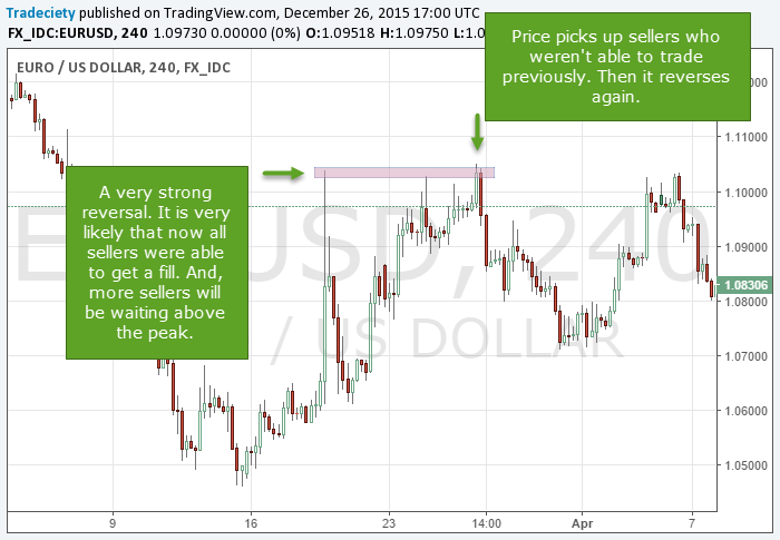
But this is not only hindsight market analysis; you can use this knowledge to make assumptions about future price movements too. Whenever you see such a supply or demand price area it is –reasonably – safe to assume that not all sellers were able to enter at that price on the first sell-off. We have all seen it before: during a high impact news event price just ran away and we weren’t able to get a fill – this is what happens as those runaway supply and demand zones too.
Furthermore, it is also very likely that, in case of a sudden sell-off, more sellers were waiting to sell just above that level. If price fell from $50.00, it is very likely that other traders were willing to sell at $51 too – who wouldn’t like to sell for a higher price? This is a trading concept called “trading the white space” and although it can be challenging to wrap your head around it when you hear about it the first time, it helps traders understand markets in a new way.
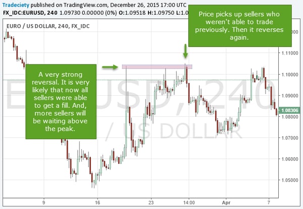
“Trading the white space” means that price picks up unfilled orders and squeezes traders on the wrong side of a market.
There are three things in particular that we look for when identifying high probability price areas:
1) A strong trending move prior to the reversal
2) The strong reversal itself. Price reverses immediately and does not stay at the level
3) A strong trend in the opposite direction.
Read more: The 6 golden rules of supply and demand
The chart below shows 6 price points that qualify as high probability price areas. All of those 6 areas show great imbalances between buyers and sellers and a sudden shift in direction. The turning points marked with numbers are initial price imbalances between buyers and sellers. The trading opportunities exist when price moves back into those areas – the areas marked with green checkmarks.
The first point was a major swing high after a rally. Price reversed with just one pinbar and dropped afterward. When it came back to the level the second time, it did not immediately reverse but it sold off eventually. Sometimes the accumulation can take a while, but as long as price does not violate the level, it remains valid.
The second point was a pullback during a downtrend. The bullish pullback was a strong one with 3 large bullish candles. Still, price reversed in a strong fashion and continued its downtrend afterward. The next time price came back it sold off again.
The third point was a price bottom. After a long downtrend, price bounced strong and the next time price came back, it found buying support again. And it goes on like this forever…
Just pull up any price chart and try to find those areas when the trend immediately reversed. The stronger the rejection of the level and the stronger the trending moves before and after the reversal, the higher the likelihood that you will see a new reaction the next time price comes back.
You can find this pattern in all markets, asset classes and timeframes because it is the manifestation of the interaction of buyers and sellers. Of course, the pattern won’t work all the time, but it provides enough information about order flow that it enables traders to find high probability price levels.
Especially in the case of Forex majors or stocks with a high market capitalization, it requires a significant imbalance between buyers and sellers to let a market reverse immediately.
We have been trading supply and demand strategies for over ten years, and they have stood the test of time remarkably well. Supply and demand is...
3 min read
Choosing the right trading journal is essential for traders wanting to analyze performance, refine strategies, and improve consistency. In this...
3 min read
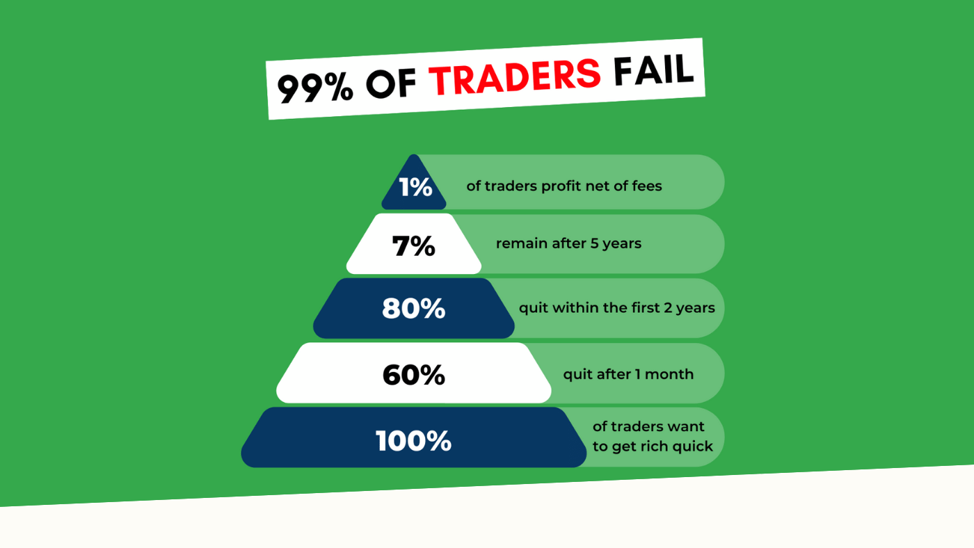
“95% of all traders fail” is the most commonly used trading related statistic around the internet. But no research paper exists that proves this...