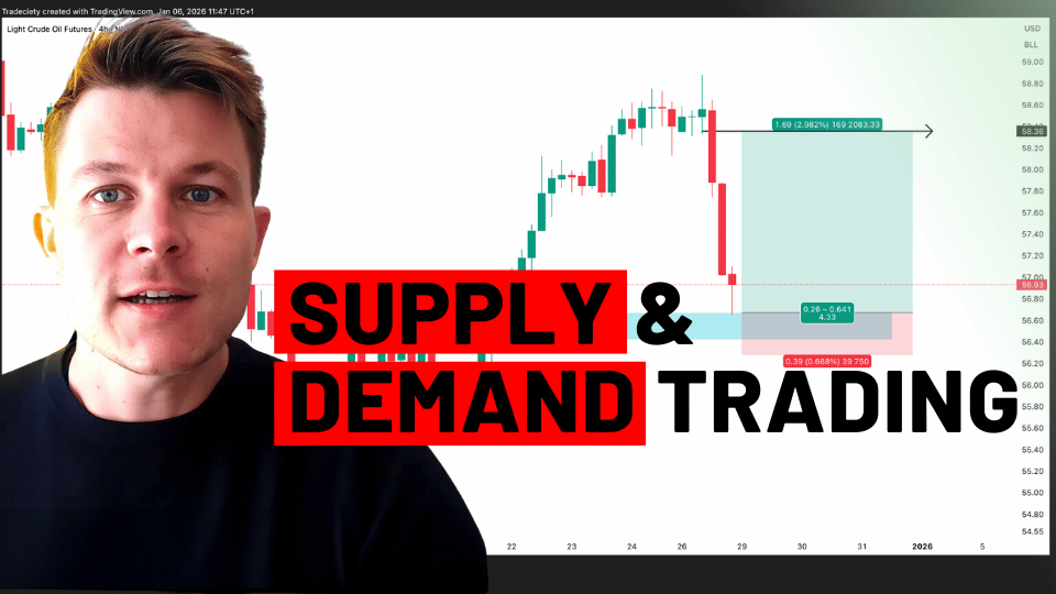
Supply and Demand Trading in 2026
We have been trading supply and demand strategies for over ten years, and they have stood the test of time remarkably well. Supply and demand is...
At the core of every price analysis, price action is the most important factor. In this special video, I am providing a complete step by step trading guide around price action and the most important principles that will help you understand price action charts on a whole new level.
(00:00):
I’ve been trading price action for around 14 years. And today I’ve put together a very special in-depth price action mini course, and I’ve divided it into four chapters. First, we’re going to start now looking at candlesticks and why candlesticks are so important. Second, we’re going to take a look at price patterns. Third, we understand trend analysis and what it takes to analyze trends and what is the good trend context. And in chapter four, we will conclude by looking at different tools, even some indicators to just round of this mini course here in YouTube. So make sure to stick around until the end. I prepared a lot of specials, lots of chart studies, and a lot of examples to help you understand price action in no time.
(00:43):
All right, so now we’re going to jump into this YouTube price action course. And as I have shown you, we start at candlesticks and then we make our way down to patterns and trend analysis. And many traders may believe that candlesticks are not reliable. They’re not strong enough because what do they tell you? Because they are just one simple, single thing on our price action charts. However, when we start at the higher timeframes and when we look at this candlestick here that I have circled. Now we are on the daily and we go lower. And this candlestick suddenly turns into a broader pattern that shows us a lot of more information because this single candlestick on the higher timeframes, if we zoom in, turns into dozens of lower timeframe candles, and there, we can slowly start to understand the interaction and the battle that is always going on between the buyers and the sellers. And this is really where you want to get to, because this is what shapes the markets. This is what shapes the trends. This is how you understand where the price is likely to go next. How do you position yourselves? And we can even take this one step further and we can go further down on a timeframe. And now the single candlestick is showing us multiple trends and interactions. We have channels, we have turning phases, transitions, breakouts, and here we can really nicely understand the microstructure between the buyers and the sellers and this constant battle that is always going on behind the scenes. So really recommend an urge you to be open. We’re going to spend a few minutes on candids. I will show you the most important candles. And then we will dig into patterns and lower timeframes and how to put everything together, to really understand what is going on behind the scenes. So we will start chapter one with candles, and we’re going to just spend a few moments on candlestick analysis and what is important before we then go deeper into pattern and trend analysis. However, this is very important, so make sure to stick around.
(02:43):
And when we look at a candlestick, then obviously at first glance, we don’t have a lot of information. It’s just the candle body here, this white part. And then we have our candlestick wicks sticking out to both ends of the candle. However, we can translate a candlestick into the path of price. And obviously we don’t know exactly the sequence of the price, but what we can see is this is a bullish price action candle. So the market opened here at the low of the candle body, and it closed here, and during the whole duration of the candelstick to total volatility was all the way from the low end of the candlestick wick to the upper end. So what does this tell us? It tells us that the market opened here on the candlestick. It probably moved lower here to form the low of the candle. And it then moved all the way to the highest point of the candlestick. And then it closed at the end of the candlestick body here. So we can translate a candlestick into a very nice price graph. And if we then combine different candlesticks, we can nicely plot this over time. And this is very important. It’s obviously a very basic way of looking at candlesticks, but it’s always a good reminder to just remind yourself that a candlestick is more than just the body and the wick, but it really nicely shows you the path of price. And when we put the different candlesticks on a spectrum, we can then very nicely show the bullish to neutral, to bearish side of candlesticks or how they are displayed. A very bullish candlestick is a candlestick where you just have one large candlestick body and no, or very, very tiny candlestick wicks.
(04:29):
And then you can see the smaller the candlestick body becomes. And the more wick we have, the less bullish it becomes because yes, the price did push all the way to the highest point here compared, but the close watch was much lower. So this means that although the buyers were able to push the price all the way to the highest point, there were some sellers in the market that then pushed the price lower and the, the candlestick wasn’t able to close at a highest high point. And then we can take this one step further. You can see here still the price was able to push higher, but the candle closed significantly lower. So there were more sellers here in this market compared to here. And definitely compared to here. Here we are having a doji candlestick, which is just a very long wick and the candlestick bodies at the same place or the open and the lower in the same area. But I will come back to that in a moment when we look at the most important candlesticks. And then obviously when we can do this the same in the bearish side and at the most, right at the very bearish area, we have just a bearish candlestick, the price opened here at the top, and then it closed here at the end of the candle. And during the whole duration of the candlestick, there was only one direction for the price. And that was lower here. You can see the price opened at the, at the high point of the candle. Stick, it closed at a low of the body during the duration of the candle, the price was able to move lower, but there were some buyers in, or maybe there was some profit taking from the sellers that then led the price to close a little bit higher. So it’s really important. And it can be very helpful later on to understand the duration or the path of the price, and also be able to distinguish between very bullish, bullish, neutral and bearish candlestick signlas, especially when we then combine it later in a multi timeframe approach as we will see.
(06:25):
So the most important candlesticks are usually the pinbar. And I would come back to the pinbar in a moment because it’s just such an interesting and important candlestick, especially when we take a higher timeframe pinbar and then look at it on the lower timeframe, and the duration and the path of the price. What we see is the price was opening here at the top point, then during the duration, the price moved all the way to the highest point. But, and is the most important part, then the sellers came in or there was some profit taking on the buying side, but both are leading to a significant decline in the price action. And then the price closed much lower than the opening price and significantly lower from the all-time high. So what does shows you is a pinbar is usually a reversal candle. Usually what happens is then the price is then moving lower away from the candlestick wick. So in this case, this is a bearish pinbar. The price may move then lower into the opposite. However, we will see that context and trend analysis and trend context play a huge role in the analysis and a prediction of price using candlesticks.
(07:38):
The hanging man is the opposite. And you can see that here, the price was opening here. It closed here. And during the duration of the cattle, the price was trying to move lower, was rejected. And then here you can see the market close to all the way here. So there was some selling interest in the market. The price was then pushed higher by buyers or sellers who took profit. And then the price closed much, much higher here on the hanging man. And the hanging man really depends a lot, or most of the things really depend a lot on context. Whereas the hanging man or the pin by happening, is it in a long downtrend? Is it in a long uptrend? And what is the context around which we will cover in a moment.
(08:19):
Then we have the Marubozu. The Marubozuas as indicated here on this spectrum, it is on the far left and also on the far right. And it’s just simply an indication of a very strong price move to price opened here, at the low of the candle. And it closed at absolute high. And as I said, the only thing that happens during the duration of this candle was that the price moved higher. There was no or very little intersection or in injection or opposition, rather from the selling side, the price only knew one direction during this candel. It moved from the beginning to the top higher, and the opposite is true for the bearish candle. It opened here, it closed here, and there was only one direction during the duration of this Marubozu candle, and it was lower. And usually what happens is that the market will usually go into the direction of Marubozu. So in this case, it is a bullish indication, or it may foreshadow a bullish move. In this case, it may foreshadow more bearishness.
(09:23):
The doji is a neutral candle. It’s a very important, but I feel in this candle, the context is even more important. Where is it happening? Is it happening in a strong trend? Is it happening at the exhaustion of a trend? And what are the candles around it? There are three candlestick patterns that we will learn later in just actually the next slide. And they are all using the doji as a foundation, but the doji, what does it tell you? It is more of an indecision candle. It is a neutral candlestick, the price opened here at the body. It may have moved all the way to the top and all the way to the bottom and then close right where it opened, or obviously the opposite could have been true. It may have opened at the body open. It may have moved lower first may have moved higher first afterwards, and then closed at the body. So we could also flip this around without looking at a lower timeframe we will not know exactly if the price moved higher first or lower first, but that doesn’t matter. The most important part, and the most important piece of information of the doji is that it is a neutral candle, the price closed right where it opened. And there was a lot of volatility in between.
(10:34):
And now we’re going to take a look at candlestick patterns that are made up of two or three candlesticks. So, whereas previously we have looked at the pinbar, the hanging man, the doji, the Marubozu. Those are all one candlestick patterns. Now we’re going to expand our horizon a little bit. And the engulfing candle pattern is made up of two candlesticks. The first candlesticks is a small candle and the second candlestick is a much larger. And as the name suggests completely engulfs the first one. So the second candlestick is completely outside of the range of the first one. And there are some variations, some traders only accept an engulfing candle if the full candle, if the full first candle is engolfed, some traders like me, I would also accept if just the candlestick body of the second candle is engulfing the candlestick previously, but there are a few variations. You have to find out what makes sense to you. And, after a while, after some charting experience, you will see different types of things. And then you can form your own opinion. But in the beginning you could just keep it simple. And your only rule can be the second candle must fully engulf the first candle. And what happens here, if we just follow the path of the price action, here is where this small candle opened. Then what have happened is that the price moved lower all the way to the bottom here. This is where this candle opened, and you can see then, on the end of this candle, the price was moving higher and then closed here.
(12:11):
So we have a move from the middle to the absolute low, to the absolute high. And then we closed here. And the engulfing candle is usually a reversal candle. And what happens is that usually we’ll see that the price is coming here from the top left. So during the duration of a downtrend, it is very important, or it can be very helpful to witness and engolfing candle, because if you see that a downtrend is ending in a small candle, and then it is being reversed by a very strong engulfing bullish candle, then very often you would see a continuation into the direction, often engolfing candle. So it’s a very nice and very important and highly effective reversal signal.
(12:53):
The 3 inside up is a three candlestick pattern as the name suggests. So it’s even one more candle then our engulfing, and you can see, we have a few characteristics. You have first usually what you’ll see is that it happens during a downtrend. So the market is coming down. You still have a strong bearish candle here. Then you have often something that looks like a pinbar to the downside where the market is poking into a new low, poking lower than the previous bearish candle, indicating at first that the market may continue to the downside and may move lower. However, this candle then is closing higher, and this is very important because it then shows you a so-called rejection of the lows. The market try to make a new low, but the buyers came in, rejected the lows and push the price higher. And then the next candle, the third candle, it’s usually a strong bullish candle. It doesn’t have to be a complete Marubozu. They can be smaller wicks. However, you want to see a strong candle here to third-part and then you can see when we just follow the path of the price action, we start here, we move all the way to the bottom here. And then we close here. So this is a very interesting and very powerful reversal pattern. And the three candlestick patterns are usually, or usually have a much higher predictive value than a single candlesticks and two candlesticks, because obviously you have way more information. You have three times the information content compared to a pinbar, and you have a lot more context compared to a pinbar.
(14:29):
And another, the last candlestick that we are looking at is the evening star. It’s also a three candlestick pattern and it’s a reversal pattern into the opposite direction. So usually what happens is that you just see this in a strong uptrend. You can see a very strong bullish candle. The market is moving higher quickly. Then you have usually a small doji. It can also be a pinbar. This then here, your evening star, which shows a neutral candlestick. The market is indecided. The buyers are not able to push the price higher. The sellers are not able to push the price lower, but this is the most important part is that this strong buying was not continued. Usually after a very strong bullish candle, you would expect more buying to occur, especially if this happening in a long uptrend, however, this didn’t happen. Then the next candle, you have a strong bearish candle. So when we follow the price action, you can see here that the market is starting at the lows, moving higher, moving all the way here, pausing here, and then closing all the way here. This is a very strong reversal setup, and often the market continues away from the evening star.
(15:37):
So let’s move on to chapter two and let’s take a look at price patterns and canvas the patterns. And as I said, I’ve been trading for around 14 years now. And one of my main expertise is price patterns and chart patterns. So I really, really enjoyed them. I have studied them extensively and I look forward to showing you why it is so important to know about those. So we can connect and make the bridge between candlesticks and price patterns. So, again, as I’ve shown you in the beginning, the pinbar by example, and we can just recap here, just a moment. The candlestick, the pinbar here is turning into a broader pattern on the lower timeframes who will see this as a very important pattern with a strong signal here, and a strong trading setup, actually here, a breakout and a pullback strategy. And when we go even further, those pinbars on the higher timeframe, turn into complete trends and trending markets on the lower timeframe. So this is really fascinating. I feel once you really see the connection between higher timeframe, where we just have the macro picture and then the lower timeframe where we see really in detail, what is actually happening to the battle between the buyers and the sellers that is going on.
(16:52):
So we can have a very similar example here on the left. We have the daily timeframe and here we have an engulfing candlestick. You can see the black candlestick is fully outside of the first white one. Then when we go one timeframe lower, you will see not too much has changed. We still see here a little bit of a engulfing candle, a lot of big rejection, but if we then go from the daily to the one hour, this engulfing candlestick formation, those two candlesticks are now making up a complete candlestick pattern with a very nice trend structure that we can observe. We can look at the higher highs and higher lows. We can look at the trend strength, how strong is the price pushing into it. And especially in chapter three, we’re going to take a very deep look into trend analysis. We’re going to understand when our trends likely continue when our trends likely to be over, when our trends turning, and we can see that then in those patterns. So again, candlesticks, macro, lower timeframes patterns, very low timeframes. Then we can see the trends. So this is going to be a very fascinating journey.
(18:02):
And I’ve put together the most important and most reliable chart patterns. And there are a few classic books out there. I think Edward and McGee, I’m not sure what the name is, but if you type in Edward and McGee or in trading or chart analysis on Amazon, you should find something that is, this is considered the Bible. And they also put in the head and shoulders as I think the most reliable chart pattern that there is, and head and shoulders as the name suggests has the component of a head and two shoulders. So we have the head, which is the highest point we have the right and the left shoulder to both sides and head and shoulders is a reversal pattern. You usually want to see that the pattern is occurring in a strong uptrend and in an uptrend, as we will learn, what usually happens is that uptrend is continued when the price is making higher highs and higher lows. However, the head and shoulders shows us that on the left side from the head, this was true to make the market was making higher highs and higher lows. But on the right side, the right shoulder indicates that the market wasn’t able to push higher and is making a lower high, which is a very significant setup and signal. And we have also, obviously we have a head, we have the right shoulder and then we have our neck line. And where, once the price breaks underneath the neck line, this is usually when the head and shoulders has been triggered. This is when the market is not only making a lower high from the head to the right shoulder, but sorry if I did the mic, but the market is also making a lower, low and the first lower low. So this trend structure is now completely broken, and this is often where you can see them, the trends turn around. So the head and shoulders often marks the end point of a uptrend and often foreshadows a downtrend that is about to start. And in the beginning, what I would recommend sometimes switch on the line graph on your charts. And those patterns may become obvious a little bit quicker and easier, and don’t get discouraged if it doesn’t make sense in the beginning, just play around with it, study different head and shoulders, different chart patterns, and then your eyes and your mind will get trained to this pattern recognition skill.
(20:26):
And obviously we can also flip this around. So instead of a head and shoulders at an uptrend, we can also look at an inverse head and shoulder at a downtrend. So after the market has been going lower and lower, then often what we see is the left shoulder and the head, the market, and in this case, the market isn’t even making a lower, low, it’s more what we would call a double bottom. And then in this case, we also don’t have a straight neck line, but more of a tilted neck line. And we can use that with a trendline. And what you usually do is that you either trade the breakout or you trade the pullback. And I think my last video was about the difference between pullback and trend trading. So I will also make sure to put that in the video description below, check that out if you want to see the difference between a pullback trading approach and a breakout. And head and shoulders can usually be used for both. Sometimes you will have an immediate breakout and retest. Sometimes you won’t, but there’s all explained in the other YouTube video I just made.
(21:30):
And there are a lot of variations. Obviously a head and shoulders can come in many different ways and shapes. And I really urge you to study the different variations because what happens is that most trading books, trading websites, trading literature, focuses on those textbook head and shoulders or textbook patterns in general. But what happens is that in reality, the real market doesn’t follow your textbook. And the price action, candlesticks trends, they are very dynamic and it’s very messy. And what happens is that if you are just trained to look for those perfect patterns, you will miss a lot of trading opportunities and those very beautiful, obvious, and easy to support patterns, what happens is that I feel in my experience shows that they fail a little bit more often because this is where everybody is jumping on the same thing. And if there’s one thing true in trading is that if one thing is just too good to be true, then it’s it’s usually is, and this is definitely true for patterns as well.
(22:43):
So here we have some variation of a head and shoulders. We have a left shoulder that is taking a little bit longer. We have a right shoulder at a significantly lower from the head, and this is often referred to as a breakout buildup. And I also made some videos on my YouTube channel around breakout buildups. You can check that out, but what is generally tells you is that here in this example, we have a very straight neck line, which is preferred because it’s a little bit more objective than when we look at those tilted ones. And I will show you that in a moment. And the market here on the right shoulder is really sticking to the previous low. Whereas previously the market was always able to push higher quite easily, on this right shoulder, something different happened. And the market wasn’t able to push higher at all. The market was really sticking to the level. And this tells us that, whereas previously, the buyers were able to push the price higher here, the sellers here were able to keep the price low. And it was probably significantly more selling interest than buying interest. And this may foreshadow here, then this turnaround. Obviously we don’t know in advance if the market would really break out. And this is one of the most important rules when it comes to pattern trading, is that you always need to wait for the market to break out of your pattern. It is an example, we are looking at head and shoulder. You need to wait out for the market to fully break the head and shoulders pattern.
(24:07):
Here we have a wedge pattern, and wedges are also considered in a classic sense reverses, but I will show you in the next example where a wedge is also a continuation. So what happens is that the market is coming here from the left in a strong uptrend. And the wedge really nicely shows you how a strong uptrend is then slowly fading. As we would say in trading, there’s not a lot of buying interest anymore. And whereas previously, in a short amount of time here, the price was able to move higher quite a bit here in a much longer period of time, the price wasn’t able to move that much higher. So this tells us already that the difference between the buying and selling has definitely changed. And there are not a lot of buyers anymore. The price may have become so high that it’s not attractive for the buyers anymore, and it’s high enough for the sellers to become interested. And when we look at the highs, especially where if you connect the highs here, you can see the market did rise very quickly here. When we connect the highs, we have a significantly less steep trendline going on here, and there’s less steep rise here. So shows us that although the price did move higher, kind of, it is a very, very weak indication here that not a lot of buyers are anymore in the market. And then what you generally want to do is you want to wait for the market to break out of your wedge pattern, and which is made up of a trendline here at the bottom, where we connect the lows to form the trendline. And you generally want to see that the market is breaking out of the wedge and also breaking into a new law. So now the market is making a lower low, and it made also lower high here already. So this is how you see a good wedge pattern.
(25:55):
Wedge continuations sometimes are also referred to as flags. And I remember Morris saying in our mentoring program, the link to that is also under description, is that flags are one of the most reliable patterns that you can find. They are usually considered trend continuations and what they show you is a temporary pause in an overall trend. And in the next chapter, I will go very deep into trend analysis. However, what we can already see is that the market is going higher here. Then obviously trends were never just through higher in one straight line. However, every trend is coming to an end eventually. And sometimes the trend is just going to pause for a moment, so that some people who made profits are going to take profits here, and some people are trying to sell. And then the price may, as we say, retrace, so it’s making a pull back. And sometimes those pullbacks, turn into new trends. But very often, especially if you are in a long, higher timeframe trend, you would see that those pullbacks at then converted and are rejected. So here you can see the market made a move lower here. You can see we made a double bottom. Then we have a breakout out of our wedge, which we can very nicely connect the highs here and here and here. So we have a very nicely defined wedge, and then we have a breakout and the up trend is continued. So it’s very important to look at the overall trend structure. And again, we would come into that at the moment, and understands the natural flow and the rhythm of price action. Trends will not move one straight line and there will always be this wave function and the wave formation of trends.
(27:44):
We have rectangles or Rangers, and those are also often considered continuations. And again, it depends on the trend context. So the market is coming here from an uptrend here on the left, then the uptrend, whereas previously in the wedge example, the uptrend was temporarily broken by a move lower. So sometimes those, we would call it correction waves are actually moving lower, but sometimes those correction phases are just sideways phases where the existing trend is currently pausing. Some people may take profits. Other people may trade, take new positions, and then the market moves sideways until the trend is then continued into continuation happens on the breakout out of the pattern. Again, just because you see a rectangle, and just because you can see any pattern, it doesn’t mean that you should try to get on board much sooner. A lot of traders, especially in the beginning, were suffering from so-called FOMO. The fear of missing out and those traders were then trying to outsmart the market. They try to say, okay, I’m seeing a wedge. I’m seeing a rectangle. And as we all said, this is going to lead to a continuation. So I may just be a little bit smarter than everyone else and get into the trade a little bit earlier before the market breaks out. However, obviously, nothing in trading works a hundred percent and very often those Rangers will lead to nothing. Sometimes the market will keep ranging afterward. Sometimes those ranges will even trigger into the opposite direction and then you are completely screwed. So it’s very important to wait out until you have the actual breakout out of the pattern and then make your trading decision.
(29:32):
We have triangles which are also usually considered continuations and the triangle is telling you a very nice story as well. So the market is in an uptrend, moving higher and higher and higher, then the uptrend is pausing. And we have another type of pause. So we don’t have a correction wave as in the wedge or flag. We don’t have just a very well-defined sideways range, but we have a correction wave and a phase where we have a very tightly defined upside. So a very strict resistance level. And to the downside, we have a triangle formation. And what does it tell us is that when we look at the lows we go from here to here, the market is continuously pushing higher. Whereas previously, after the market moved into this resistance, the market was able to sell off to this point and the sellers were able to push the price quite a bit lower.
(30:28):
The next time the market came into the level here. Now, the market, the sellers were not able to push the price that low, and the buyers stepped in much sooner and pushed the price up higher. And then it continued. And here we have another example of a different market, also in an uptrend also here, resistance level, and each time the market moved into this area the price was able to move lower, less and less strong. And this can often foreshadow a continuation. Again, we don’t know until the market actually breaks out, but this is usually considered a continuation pattern. And again, context really matters. Where do you see a triangle? Where do you see a wedge? Where do you see a flag? Is it in a nice trending market? Is it in a sideways market? This is very important. Try to only look for patterns in well-defined nicely trending markets and your odds of finding successful patterns may increase quite a bit.
(31:30):
And let’s conclude with our last pattern. And then we will move on to trend analysis. And the cup and handle is very often found in a stock market. Although I mostly trade Forex, I don’t see cup and handles too often. So they seem to be more a stock thing and they are generally considered a trend continuation pattern. And again, the market is in an uptrend uptrend, temporarily pauses that it moves low on tries to start a new downtrend, but the buyers are coming in and pushing the price higher and higher and higher. When we just look at the lows, the market is already making higher lows here. Once again, then the handle is our so-called breakout buildup. It moves into the last swing high and it moved into the area where previously this led to a quite significant sell-off, but this time the market isn’t selling off at all, it’s just making a very small move. And this is often an indication that now there are quite a lot of buyers in the market. Everyone who tried to sell or who wanted to take profit here, took profits, and now they have repositioned. The price was low, that it was interesting to buy again. And maybe this is happening in an overall uptrend. Maybe there are great fundamentals here behind it. And then it makes sense to look at a cup and handle as a continuation pattern.
(32:51):
All right, now let’s move on to chapter number three, we’re going to take a look at trend analysis and I made some videos around advanced chart pattern. So if you still haven’t heard enough, make sure to check the links in the video description. I’m putting a lot of timestamps there as well, so that you can really binge on everything that I’ve done here over the years on the YouTube channel. But now it’s time for trend analysis. And trend analysis, as I already hinted one or two times is very important for context, because we can find candlesticks everywhere. We can find chart patterns everywhere, but it really matters where they happen. And very important is to trade markets that are trending, because trending markets are the ones who move, and this is then not a guarantee, but it helps us to find markets that may also move in the future. So those are the markets that we want to trade because they may show the highest profit potential for us. So we’re going to build step-by-step our knowledge about trend analysis as always. And when we look at a trend we can, and we should distinguish between different terms and we can look at the overall trend. And as I said, the market never just goes in one straight line in a trend, but there’s always this back and forth, this back and forth. It’s a interaction between the buyers who want to drive the price up because they buy, and the sellers who are the force behind pushing the market lower, or the buyers taking profit and so on. And this is then creating this rhythm of the markets, and you will find it, whether you trade Forex, stocks, commodities, even cryptos, you would see this rhythm function and this rhythm feature, we are looking at a long-term uptrend, but in those long-term uptrend, we are looking at small waves into the trend direction. And then we’re looking at ranges. And as I said, Rangers can come in many different farms. They can be sideways, they can be against the trend direction. They can be triangles. So this is usually the different terms that we’re looking at. And what is also important is the sequence. You will often see that a trend is topping out with a pattern very often, and then it’s leading into new trend. And usually what we see is here, we have our continuation trading approach, trading opportunities in form of flags, Rangers, cup and handles, wedges. And then at the top of a trend after a mature trend, this is where we can start looking for reversal patterns, such as a head and shoulders.
(35:35):
Charts, usually don’t follow textbook, as I said, and you can look at those very nicely moving trends all day long, but the reality looks usually a little bit more messy, and it is very important that you are also open to studying those. So of course we can see that the market is trending here. Then the trend is becoming less strong than the market is not able to move higher at all. And we can still put everything into context. We can still use those terms that we have used here on a little bit more of a messy approach, but what is really helping us is to look at the building blocks.
(36:12):
What actually makes up a trend, what is actually driving the price higher and lower, and what are the building blocks that we can use to simplify and to make our price analysis significantly more effective. And highs and lows are the building blocks of trends of patterns of pretty much anything. And you may have heard about highs and lows before. However, if you really understand why you actually using those and how they really make up your charts, the power of them will become much, much clearer. And as I said, during an uptrend, what is happening is that the market makes higher highs and higher highs and higher highs and higher highs. And when we look at the lows, the market makes a higher, low, higher, low, and a higher, low, and higher low, and this is showing us a healthy trend structure. But once this healthy trend structure is broken, that is often when you see reversal opportunities.
(37:16):
So, whereas here you are looking for patterns that are into the trend direction, and there can be many different ways that as I’ve show, you can also look at a few different trading approaches that we’ll show later at chapter number four. Um, but once you have seen that as higher high and higher low structure is broken, then your focus should shift to a reversal approach. And to either, if you are still in a trade to try to get out, because now it’s not as likely to see the price move higher, or to even look for selling opportunities. So here you can see here was the higher high. Then here we have a lower high and we had a lower low before. So now we have a complete trend change here from higher highs and higher lows to lower lows and lower highs. And then you can see this foreshadows, the complete collapse of the market here.
(38:09):
And another thing is that obviously it’s important to look at higher highs and higher lows, but it’s also very important to ask how fast is a trend rising and how steep is it. And also is the trend accelerating or decelerating. And this is very important and trend waves you can see they move higher, but as obviously a very big difference between how the market moved higher here, here, and here. Whereas here in the beginning, the price in a very short period of time moved higher a lot here. You can see the price initially moved higher, but then the market was pausing here for quite a long period of time. So this shows us that yes, the price did move higher, but it wasn’t able to continue higher that easily. So it shows us that now the price has become high so that it’s not as attractive anymore to buy. And it’s probably more attractive to sell and to take profits here.
(39:11):
If you have been trading higher here, and then here, you can see the market is making a very weak attempt to move higher. Whereas from here to here and from here to here, the market moved higher quite a lot. And the distance between the highs and the lowest is quite a significant, the distance from this high to this high is much, much shorter. So the prices obviously not rising as strong. And then this often then shows you or foreshadows a complete collapse, especially when you don’t see the market has made lower highs. And then it’s also making lower lows here on the breakout. We can also apply it here on the right-hand side. The trends were very strong here on the left hand side. So the market was going down in a very strong way, then here, suddenly the market isn’t able to move lower as easily. You can see from this low to this low, the price was moving lower quite a bit. And from this low to this low, the price was almost not able to make a lower low at all. And then from here as well. And you can see that the trend is very slowly dying down. It is losing momentum. It is decelerating clearly. And then here on the right side, the market is then even moving higher. So now we are seeing a higher, low, and we are seeing a higher high here. So when we really pay attention to those individual building blocks, highs, and lows, but even go further into how strong and how fast are those highs and lows moving. Then we can take our trend analysis to a completely new level.
(40:43):
We can also incorporate the theory of the Dow theory, and you can look it up. The Dow theory is simply saying that the markets and a trend is likely to continue as long as there are higher highs and higher lows in an uptrend and lower lows and lower highs in a downtrend. And here you can see I marked lows and the highs here, the market was very healthy here on the left-hand side, but something has changed here to market was making lower highs here already. And then here, it made lower lows as well. So here you can see the market may have already indicated a change here. However, the market never really made a lower low, so it continued higher. And then here is really where things changed. We have a series of lower highs, and then we had also a series of lower lows. And this is a very good way of looking at trends because it keeps you away from the so-called top and bottom picking.
(41:41):
And another problem besides FOMO or where it is also ties in with FOMO is that a lot of traders try to predict turning points. They may have missed here all the upside potential in all the upside move. So obviously they are frustrated because they could have made a lot of money, but they didn’t. And then their thinking shifts to, if I can just time the short at the best possible time, if I can predict when the market is moving lower, then I will have the best entry price and the biggest profit potential. And I can make up everything that I didn’t make here. So what is happening is that we call it catching a falling knife and trading, and the traders try to predict what may happen without a lot of context. However, if you always wait for the market to make lower highs and lower lows, you are automatically forced to wait and to such a structure has developed, and you’re not able to get in sooner because you don’t have any information and confirmation that the market is really changing the Dow theory concepts.
(42:43):
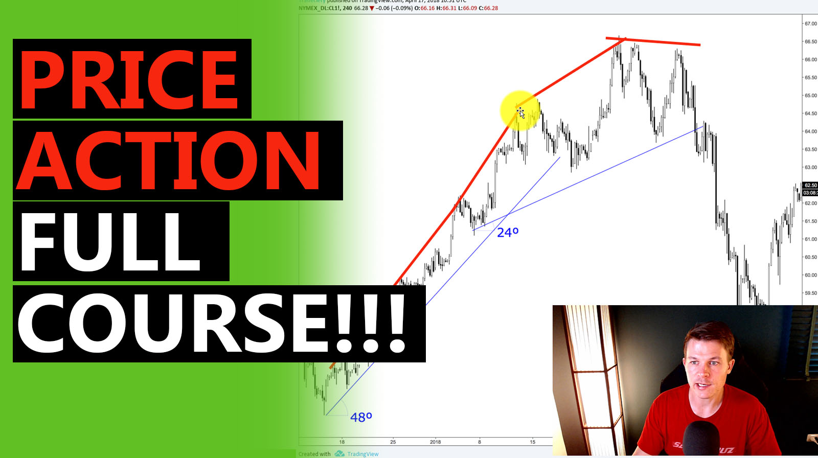
Another tool that I really like, and I will get back to that is just using trendlines, and trendlines help you have a little bit more of an objective way of analyzing trends, and you can use trendline analysis on the lows, or we can also use it on the highs. So let’s start here by, we are on the left side, we are in an uptrend. And when we connect, the highs you can see from here to here to here to market was rising quite quickly. But then here, the angle changes from here to here, the market wasn’t able to rise us quick, and then it really becomes clear when you connect the highs from here to here. Now you can see the angle is significantly dropping off. And then here, the market is even making lower highs and we can do the same here on the downside. You can see when we connect the lows here, we have a very steep trendline. And when we connect the lows around here, then you’ll see the angle has halfed where it was 48. Now it’s 24 degrees. So everything is pointing towards a loss of bullish interest. The highs are not able to move higher that quickly. And the lowest are also here are coming down further and further. So very, very important piece to the puzzle. And you can see this all foreshadowed here and the complete collapse.
(44:00):
So now we have taken a look at trends. We have taken looks at price action, patterns and candlesticks. And now I just want to give you a few other tools, indicators, or tips of how you can further improve your price action reading and your chart reading. So the first one is moving averages, moving averages are considered an indicator. However, there are more actually a price action tool, because they are directly a substitute for price action. So an indicator or a moving average, we’re just looking at the last 10, 20, 30 candles, depending on the length of your indicator. And then it would just give you an average of the price action. So this is a very, very helpful and a very powerful indicator, it is also used a lot in algorithmic trading. And this is probably also why moving averages are so powerful because just such a variety of traders are using moving averages. And I would recommend if you’re looking to use moving averages, you are sticking to the big round numbers, so to speak, which are generally considered a 20 period, the 50, which is my personal favorite, the 100 and a 200 period moving average. And you can see, I plotted a few moving averages, two actually on the chart and they are also great for pullback trading.
(45:22):
And first of all, the way a moving average is used is that you only trade into the direction of the moving average. So when the price action is above the moving average, you’re only looking for long opportunities, buying trades. And the best price to buy is obviously when the price is low and the moving average helps you find that. So you want to find when the trend is pulling back into a moving average, and this is where you want to trade, because you will get the best possible price. It’s the historic average of your price action. And it is still in the context of the, of the trend. You don’t want to trade long when the price is below, because then it’s indicating that the price is very cheap and it is more likely that you are now in a downtrending scenario, such as here, the market dipped actively below both moving averages. And then the downtrend is starting. And in this case, you want to look for selling opportunities at the moving averages. So this is a great way for a higher timeframe approach. If you use this, for example, as your higher timeframe, then go down to the 15 minute timeframe when the market is hitting those moving averages and look for trade continuations, you can then, for example, look for candlesticks. You can see sometimes you have pinbars, you have sideways Rangers, and then you can use those to time your trades.
(46:47):
Moving average are also used by professional traders. I have repeatedly recommended the book “Pit bull champion trader” from Marty Schwartz was also featured in the market wizards. And he said that moving averages are his red and green light. So he only trades short when the market is below a certain moving average. And he only trades as long when the market is above the moving average. And this is his way of her filtering for direction. And this is a great way, especially if you’re using a multi-timeframe approach. So here you can see, I plot a moving average. It’s probably the 50 period moving average. And by those vertical lines are indicated the break below or above the moving average. And when the price is below the moving average, such as here, you would only look for shorts when the price is above the moving average, you will only look for longs. And this is a great way of helping you establish an objective approach to finding a trend direction.
(47:48):
You can also use a moving average crossover, especially when you look for the golden cross. That is something that is very popular. So you have two moving averages and whenever they cross, this is your potential signal to start looking for trades into the direction of the cross. And especially again, with a lower timeframe approach, you would then wait, not only for the cross, but also for the market to get back to the moving average, to provide you a favorable price on the lower time frame, especially that is where you will see a lot of trading opportunities.
(48:20):
The MACD is a derivative of the moving average. It stands for moving average convergence divergence. I’m pretty sure it does. And again, the MACD also helps you determine a trend direction. So what I’ve done here is I eliminated the histogram of the MACD and I only kept the MACD lines, and I drew in the zero line here on the MACD. And what you can do is also whenever the MACD is above the zero line, you would look for long opportunities. And when we moved away, we can then see the times when the MACD is below zero. And this is then where you start looking for shorts only. And this is another objective way of just having your filter trend direction.
(49:05):
And one of my favorite signals and setups with the RSI is the RSI divergence. And the divergence means that the price action and the indicator are not agreeing. They’re showing you two different things. And whereas here on the left side, you can see the market is making higher highs and higher lows, especially here at the top. The indicator was already indicating that here, the RSI made lower highs. So the RSI looks very deep into the trend, strength analysis, and way deep into the trend waves. And it shows you that, and it tells you that here the market in a short period of time, moved higher quite a bit, but here it didn’t, it, the market just barely moved higher here, and this is what the indicator will tell you. So now let’s move just a little bit away and here we can see the divergence in the other side. So here the market was moving down, lower lows and lower highs, but ours, I was showing you that here RSI made a higher low. So it also shows you that although the price action indicated a lower low, the lower, low wasn’t as strong as the price action may make you believe. And if we look in deeper, you can see that here was already quite a big of a sideways move, which is never a strong sign of a healthy trend. Usually trends move lower and higher in an orderly fashion in a quick fashion. But when it takes long for the market to make a continuation, it may already indicate that a price is not as strong as you believe.
(50:32):
Bollinger bands are one of my absolute favorite. They are used for trend trading, but they can also be used for continuations pullbacks or reversals. And I plotted the 2.5 standard deviations here on the chart, generally speaking, and by default, you use the 2.0 standard deviation, but I like to increase it to just have a little bit more meaningful signals. And what happens in a healthy trend, you will see that the market moves between the middle line, which is the 20 period moving average and out of Bollinger Bands. And it’s usually moving very close to the Bollinger Bands. The way to trade this may then be look for trading opportunities into the trend direction. So in a downtrend, you wait for the market to get back to the moving average and then trade it outside.
(51:18):
And another way that I like to do it is that I look for Bollinger Bands spikes. So here you can see the market was showing more weakness. Whereas previously the market moved lower very easily. Here it had some struggles, from here to here the market wasn’t even able to move into the lower Bollinger bands. And then here we have a Bollinger Bands rejection. Here then the market breaks above the middle line and this is then often a reversal setup. And again, just because you have a Bollinger Band spike, it doesn’t mean you should buy or sell in the other way. It really always depends on the context. Is the trend going down? Are the Bollinger Bands being reached? And then you have a contraction of the Bollinger bands and a breakout of the middle line, and even a strong breakout out of the middle line, then all of the pieces are coming together.
(52:03):
So I made some videos about the stochastic and one of the most, or the biggest misconceptions about stochastic or indicators in general is the use of overbought and oversold. So in stochastic, usually traders refer to overbought when the stochastic enters the area above 80, and they say the market is oversold when the price is, or the stochastic is below 20. And then what they do is that I think if the market, and if the stochastic is overbought, it means that the trend is overheated and that reversal has to happen. And then they will go against the stochastic. But when you just spend a few minutes looking at the formula of what stochastics is actually doing, you will quickly see that actually the opposite is true. If the stochastic is overbought, it just means that the market is very strong. There are a lot of buying going on. You’re looking at a very strong trend in the last thing that you should do is look for shorts. You look for place with the stochastic, and the same is true here. When the stochastic is below 20, you’re looking at a very strong downtrend. And the last thing you want to do when the market is strongly moving down, you don’t want to buy, you want to go with the trend. So this is something that I would really recommend that you study, because it can really make a huge difference in your trend analysis and your understanding of charts.
(53:30):
And trendlines. One of my favorite concepts, I love trendlines. They’re very versatile. The most important thing about trendlines is that you need to have three touch points, because you can always connect with a trendline, any two random points, but only if a trendline is connecting three points, then you have actually a valid and a verified trendline, and there are two ways of how traders use trendlines, first is that they look for trades with the trendline. So in this case, once we have one and two and three, you may look for long opportunities, once the market puts back into a trend line. Or when the trendline is then broken, then you look for reversal place. Those are then breakout trading opportunities. And as I’ve indicated previously, it is very important and it can be very helpful to use a trendline, to just understand more about how strong is a trend rising and falling, is the strength of a trend decreasing or increasing. And trendlines will help you tell that with the angle, you can see the price was breaking lower very quickly. And then here in the second half of the trend, the market was very weak and the trend angle has declined quite significantly. And this can then often foreshadow a potential end of a trend. And then often even a reversal. Once the other criteria are met, that we have discovered, and there was a highs and lows and breakouts out of those structures.
(55:06):
So how it goes is usually you start your analysis at the higher timeframe you can look at, okay, where are you in the bigger picture? Are you in a trend? Are you in a range? Is the trend accelerating decelerating? Do you see maybe a candlestick that is interesting? Then you can go to the lower timeframe. You look for structures, you look for patterns. You look for either with the trend place, if you want to trade continuations, or if you see signs that the market is maybe exhausting, you look for reversal trades and you combine everything to form context, because obviously just because you have a great higher timeframe, it doesn’t mean that it should automatically get into the trade. You need to have the lower timeframe in place as well to help you time the trade. And maybe sometimes you have only a great lower timeframe, but the higher time frame is all over the place. And then you also don’t want to trade. So you really want to make sure that the higher and the lower timeframe are fitting in nicely together.
(56:05):
And if you want to learn more about price action, I have two offers for you. First of all, we do Forex mentoring, and there we will go very deep into price action analysis. I hold over two to three webinars, Moritz two to three webinars every week where we break down the live Forex markets, we analyze a top-down higher to lower timeframe. We show trading opportunities and really help you understand and master the price action systems. Or if you prefer to work on your own, then I’ve put together four trading courses for the price of one, you have an advanced price action course, a multi-timeframe approach, a supply and demand course, and also a Forex as a beginner course. And you can get all of that by checking the links in the description below. So if you want to learn more and if you want to go much, much deeper into price analysis, look for trade studies, charts studies, how to find entries, exits how to manage your trades. Then the best bet is the links in the video description below. All right, so this was a very long video. I hope you enjoyed it. I hope you learned something. If you did make sure to leave a comment, leave a thumbs up and subscribe for more weekly trading videos.
external link:

We have been trading supply and demand strategies for over ten years, and they have stood the test of time remarkably well. Supply and demand is...
3 min read
Choosing the right trading journal is essential for traders wanting to analyze performance, refine strategies, and improve consistency. In this...
3 min read
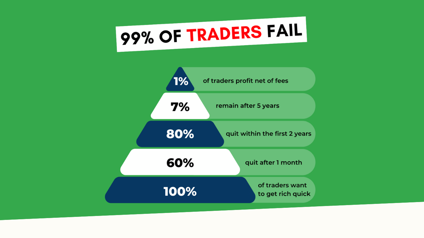
“95% of all traders fail” is the most commonly used trading related statistic around the internet. But no research paper exists that proves this...