Supply and Demand Trading in 2026
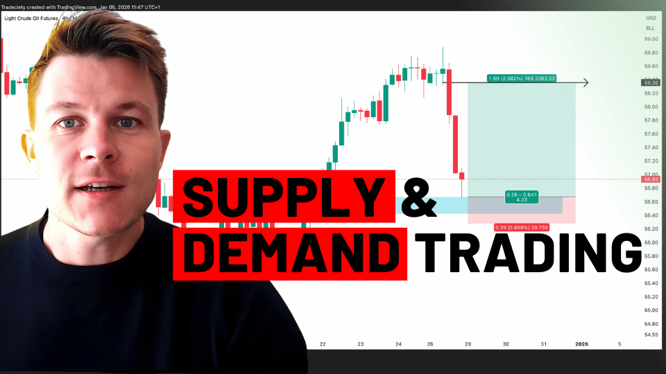
We have been trading supply and demand strategies for over ten years, and they have stood the test of time remarkably well. Supply and demand is...

The technical analysis approach revolves around evaluating and capturing mass psychology and sentiments of market participants. Regardless of which technical indicator or other tools we use, mastering this technique, for the most part, involves analyzing price trends and chart patterns.
Most beginner traders look at a chart and use the combination of technical analysis tools to make trading decisions based on a single dimension, often on a single timeframe, without paying attention to the big picture. As a result, when broader trends change or the market enter a consolidation phase, the systems they use cease to generate the accurate entry and exit signal. At this point, the beginner traders scratch their heads and do not understand how a profitable strategy suddenly stopped working.
Big Picture Analysis
In this two-part article, we will discuss how to identify and conduct macro analysis without using any special indicators, simply by looking at a chart. We will further explore how to formulate a trading decision by boiling the process down to micro factors that can help us enter a trade.
We will start by discussing momentum and how can we use it to understand the macro trends. Then, we will learn the significance of chart phases how it dictates the outcome we can expect from different trading systems. Last but not least, we will try to establish a connection between chart phases to wave analysis that will help us time our trades and complete the trinity of mastering technical analysis based macro analysis.
The best way to identify the comprehensive trend in any market would be beginning with finding out the state of momentum in the market. Once you learn to identify momentum, we can confirm the existence of a price trend in either direction, up or down. It will also help you find out if the market lacks any momentum and it is in a consolidation period.
To put it bluntly, momentum is the measurement of the trend strength. While there are several technical indicators that we can use to measure volatility and momentum, such as standard deviation based Bollinger Bands and expanding price range value-based Average Directional Movement Index (ADX). However, here, we will discuss about mastering the measurement of trend strength, the momentum, by simply looking at a Candlestick chart.
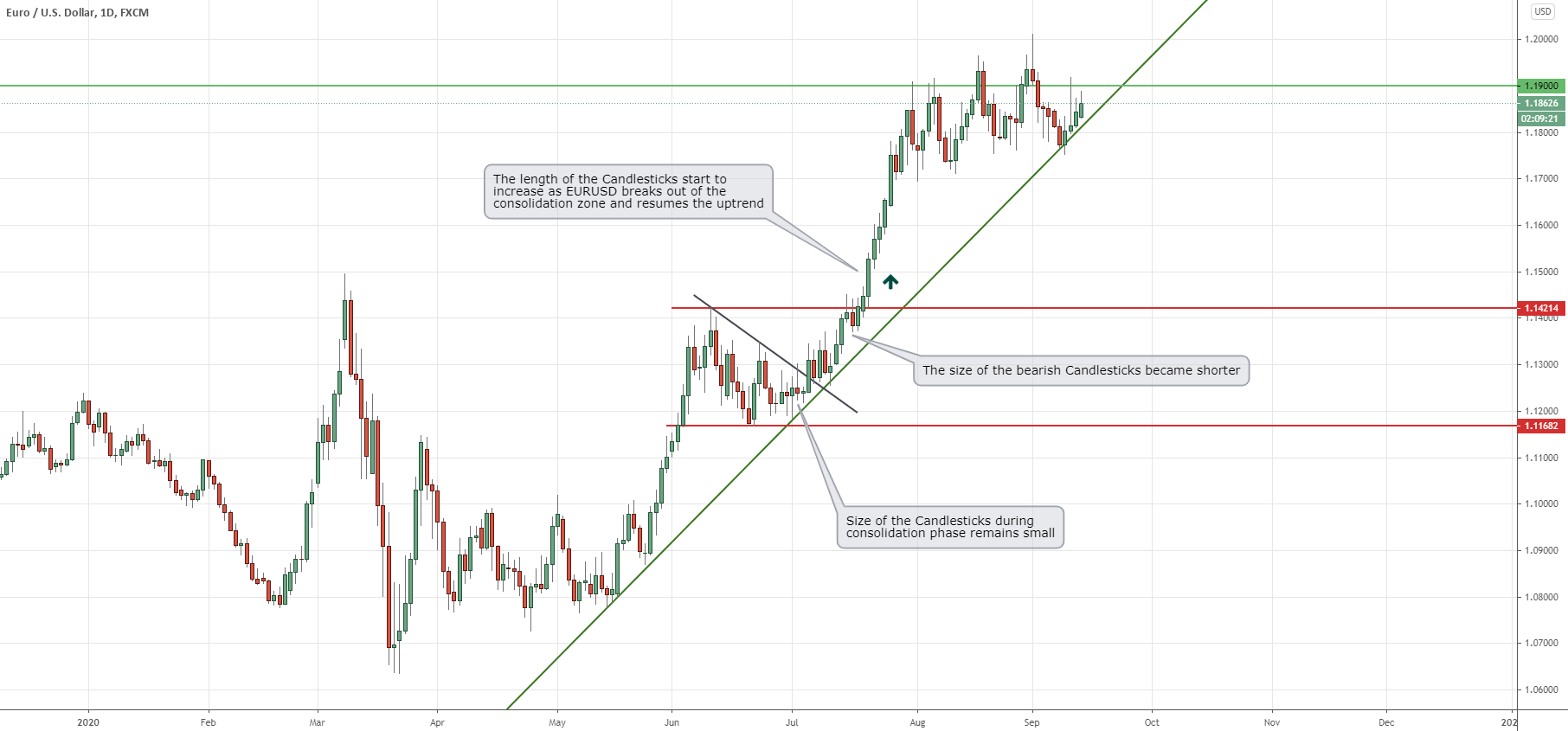
Figure 1: EURUSD Candlesticks on Daily Timeframe Indicates Bullish Momentum
If you observe any candlestick chart carefully, you will find that during a trend, the length or size of the candlesticks starts to gradually increase compared to the timeframe when it was in the consolidation phase. During an uptrend, like the example chart in figure 1, we can see the size of the Candlesticks remains relatively small during the consolidation phase on the EURUSD’s daily timeframe. However, as soon as it breaks above the resistance and the uptrend resumes, the length of the bullish (Green) Candlesticks starts to increase.
On the other hand, during this uptrend, the size of the bearish Candlesticks (Red) started to become shorter. The key to identifying momentum is thinking in terms of ratios. For example, if the bullish Candlesticks during the previous consolidation were on average 50 pips (on the Daily timeframe) in length and after the breakout, these bullish ones start to form with a length of only 25 pips, you can be certain that there is a lack of bullish momentum. But, if you see bullish candles forming with the length of 80+ or 100+ pips after a breakout, you can be pretty sure that there is a presence of strong bullish momentum in the market.
By simply observing the price action and paying attention to the size of the Candlesticks, we can easily determine in figure 1 that the buyers are dominating the market, and sellers are having a hard time pushing prices down or create any sustainable consolidation phase.
Using a similar rationale, you can also read a Candlestick chart and find divergence without any special technical indicators. For identifying divergence, you have to look at the ratio of the length of the Candlesticks, but also how long it takes the market to create new highs, during an uptrend, or new lows, during a downtrend.
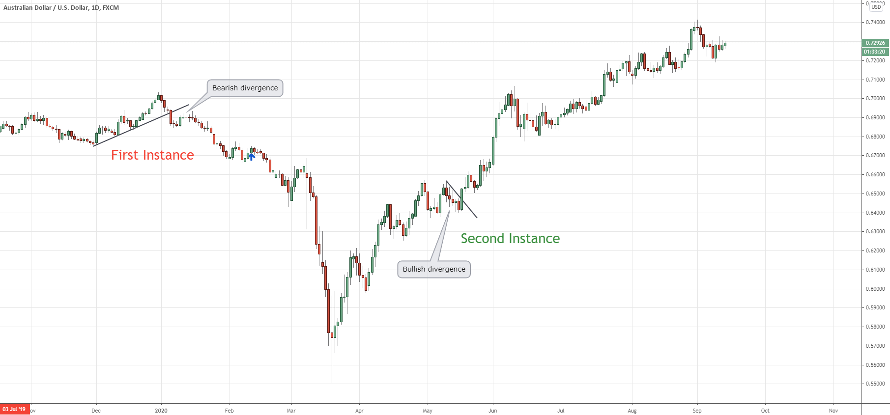
Figure 2: Identifying Divergences by Observing Price Action and Time
It may sound tricky at first glance, but let’s take a look at figure 2. In the first instance, we see some large bearish bars forming and breaking below the uptrend line. Subsequently, we see two bullish Candlesticks and a few neutral looking Candlesticks. But what is important here to observe is the size of the Candlesticks and how many Candlesticks it took to form the downtrend and the subsequent retracement. You see, the first series of bearish Candlesticks recorded a 180 pips movement. But, the next series of five bullish and neutral Candlesticks only recorded a move of only 88 pips, less than half. Since it took longer to register an up move and it failed to go more than the previous down move, we can easily conclude that there is a bearish divergence in the market.
Similarly, in the second instance, we can see the three bearish Candlesticks could not even penetrate below the of the previous two bullish Candlesticks, which signaled a bullish divergence.
The concept of identifying the chart phase is pretty simple to understand. If you come to think about it, there are only three types of markets. Price is either going up or going down, and consolidating within a range. But, if we refine these three phases, we can see that there’s more to this than meets the eye.
After the initial impulse move that started an uptrend, prices can go down or retrace for a prolonged period of time. Then, once it breaks out of the consolidation range, the market can show strong bullish momentum and trend strongly. By the end of the uptrend, we see new higher highs are made but it is taking much longer time to reach a new high, which signals that the prevailing trend is entering exhaustion or end of trend phase.
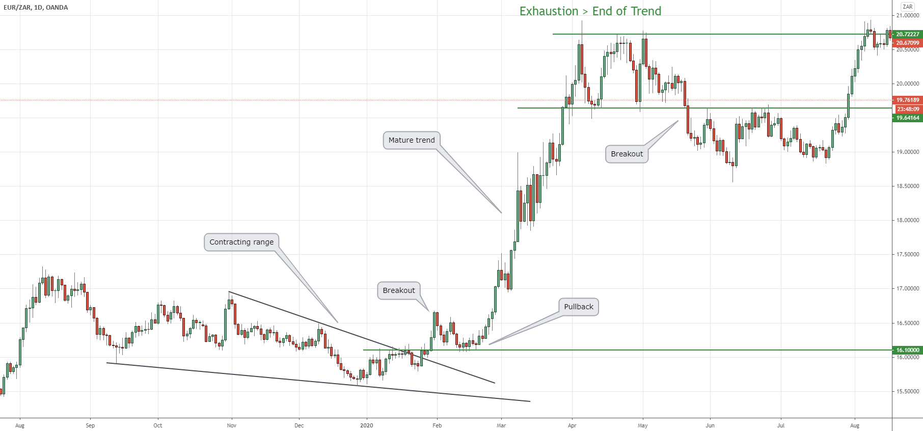
Figure 3: Identifying Different Chart Phases is an Important Factor for Long-Term Success as a Trader
As we can see in figure 3, the EUR/ZAR broke out of a bearish contracting range then swiftly pulled back to the pivot zone, where the resistance turned into support. Once it resumed the uptrend, it entered into a mature trend, which ultimately culminated in an exhaustion phase. In the end, there was a major breakout on the downside that triggered a bearish trend.
The reason for having a sound understanding of how to identify the chart phase is it basically helps you identify what type of trader you are and how your trading system should be applied. If you have a breakout trading strategy but you are trying to trade during a range-bound market with a lack of strong momentum, you will have a hard time finding entries or may enter the market at the wrong time. Similarly, if you are a pullback trader trying to enter during an up-trending market that just broke lower after finishing the exhaustion phase at the top, you will get caught in a trap and end up losing money on the trade.
Hence, knowing what type of trader you are and which chart phase your trading system is suited for is an important factor that separates the traders who are consistently profitable from the rest.
The whole business of wave analysis started with the development of the Dow theory, which was later refined by Ralph Nelson Elliott with the introduction of his Elliott Wave Theory in the 1930s.
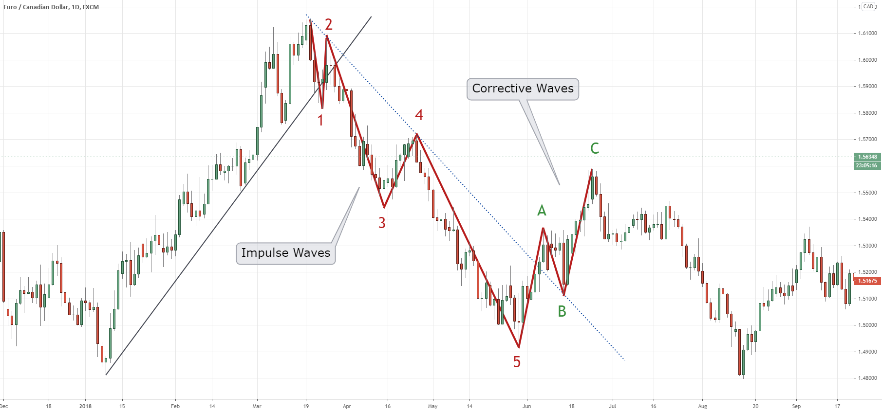
Figure 4: Example of an Elliott Wave Theory Plotted on the EUR/CAD Daily Candlestick Chart
In the nutshell, the Elliott Wave Theory dictates that prices move in financial markets in fractal wave patterns. He argued that trends start with five impulse waves, as seen in figure 4, then three corrective waves, A to C, on the opposite of the larger trend occur to complete a wave cycle.
Beginner traders may find it difficult to identify exactly which wave is currently happening in the market. Because a corrective move in the daily timeframe may appear to be an impulsive trend on the hourly timeframe. But with ample practice, and sticking to one timeframe at a time, you can easily figure out exactly which wave the market might be in.
Takeaway
The key mistake novice traders end up making is they try to trade everything and look for opportunities to enter the market all the time. Once you master the concept of macro or big picture analysis, you will start looking at price charts very differently.
While beginner traders may try to catch the first wave that breaks a trend line, once you know how to identify the second wave, you will see that entering at the start of the third wave, from 2nd to 3rd point, is often more profitable. After all, you are entering the market knowing the previous trend has already changed. Furthermore, the stop-loss would be much smaller if you put it behind the high or low of the second wave, depending on whether you are trading a downtrend or an uptrend.
Nonetheless, there are ways to trade the first impulse wave as well as at the end of the exhaustion phase, giving you a much better entry opportunity. But it is important to remember that if you have a strategy to trade the first or third impulse wave, it will likely not work if you are trying to catch a corrective move and vice-versa. Hence, having an appropriate trading system for the right wave is crucial.
In the next installment of this two-part series, we will discuss the micro concepts in trading, including how to identify the key levels in the market and exactly what signals you should look out for to time your market entries.
external link:

We have been trading supply and demand strategies for over ten years, and they have stood the test of time remarkably well. Supply and demand is...
3 min read
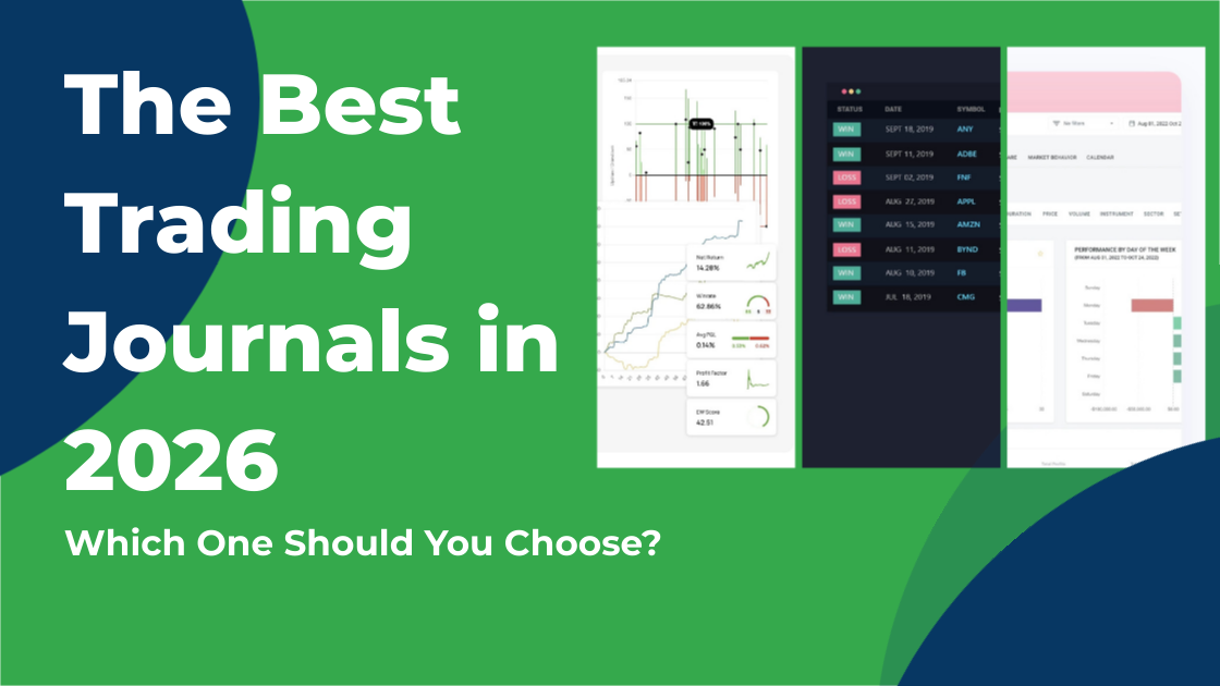
Choosing the right trading journal is essential for traders wanting to analyze performance, refine strategies, and improve consistency. In this...
3 min read
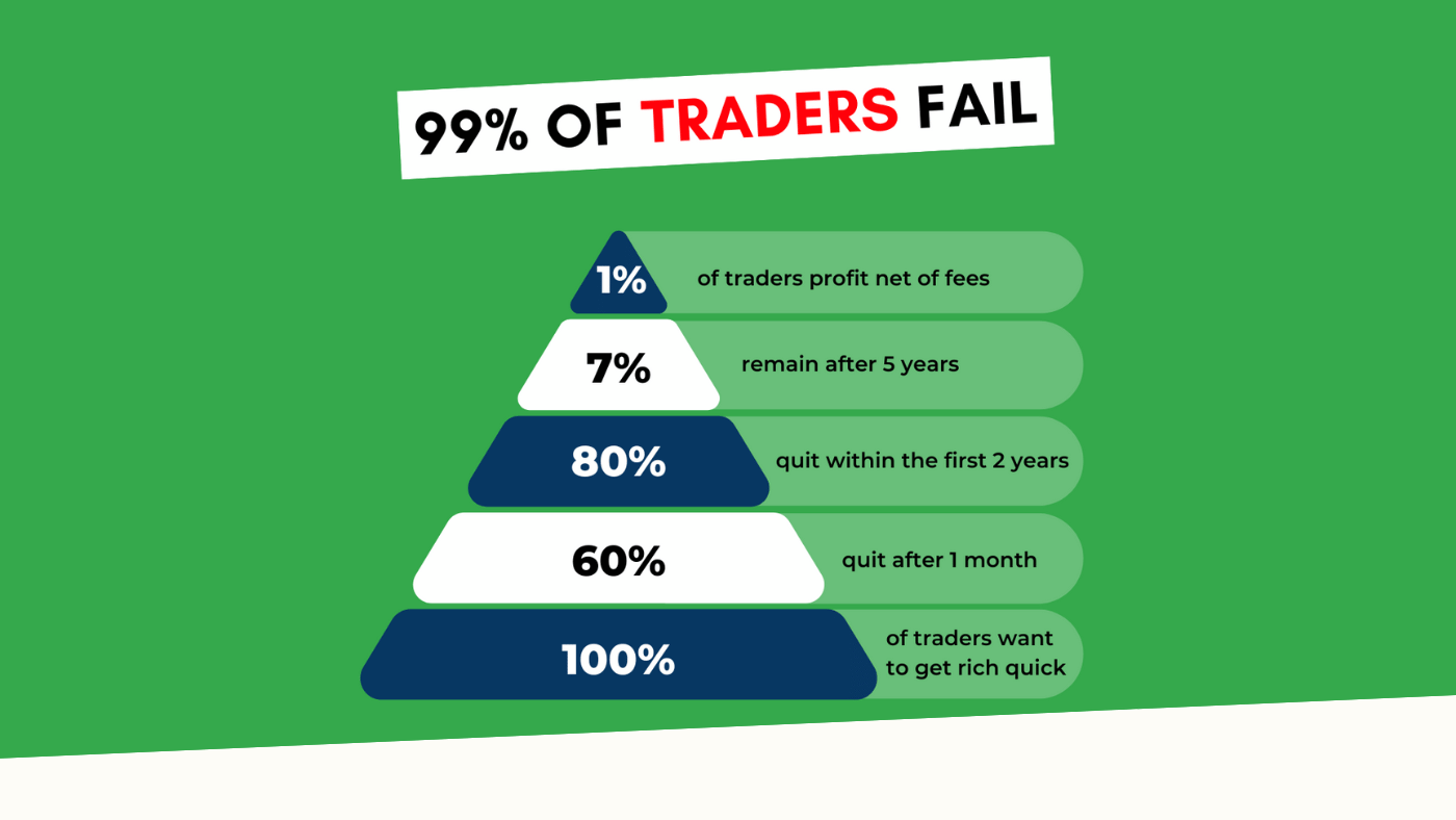
“95% of all traders fail” is the most commonly used trading related statistic around the internet. But no research paper exists that proves this...