Supply and Demand Trading in 2026
We have been trading supply and demand strategies for over ten years, and they have stood the test of time remarkably well. Supply and demand is...
4 min read
Rolf
Dec 5, 2016 7:00:00 PM

Being able to read a price action chart is important to make the right decisions. The problem many traders have is that they overcomplicate things and get easily confused – or they don’t have a process in the first place and don’t know what they are looking for.
In this article, I want to explain 5 different concepts of price and technical analysis that will help you make sense of charts and understand the price dynamics in a more effective way.
Whenever I look at a market, I start by analyzing how swing highs and swing lows manifest on the chart. Are we in a rally and is price making higher highs and higher lows? Are we in a bear market and is price showing lower lows and lower highs? Or is the market in a transitioning period where price is going from one phase to the next?
If you want to get deeper, take a look at the distance between the trend waves and swing points. Is the distance increasing during a trend? Then it usually signals a healthy and strong momentum trend. If the distance between swing points is becoming smaller, it usually shows fading momentum.
Finally, look at the depth of the pullbacks. Small pullbacks during a trend usually show a strong trend, whereas deep retracements show that there is more ‘back and forth’ going on.
Although this sounds very basic, this type of price analysis can already tell you a lot about the market that you are looking at and the price dynamics.
The screenshot below gives a closer look at the bearish period of the previous market. During a downtrend, we look for shorting opportunities and when it comes to chart analysis we look for pullbacks into previous swing highs and the following patterns: Double tops, traps and squeezes, failed breakout attempts and retests of previous support as resistance.
By combining the analysis of pure swing highs and lows with the discussed technical patterns, a trader can make much more sense of a chart.
Support and resistance areas are local structures which show previous reaction points. Support and resistance levels/areas are usually used to find high probability turning points or breakouts.
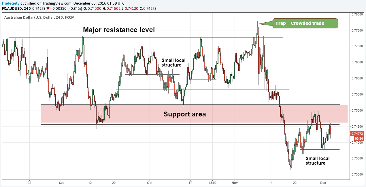
The market snapshot below shows the different ways horizontal support and resistance levels can be used. From major market boundaries, to smaller local structures which are mostly individual swing lows and highs, to huge support zones where price clusters regularly.
The flip-effect is also a common pattern where price changes from using a level as support first and after the break it uses the same level as resistance. It’s a common break-and-retest pattern worth knowing about.
When it comes to support and resistance it is also important to highlight that you don’t need perfectly precise reaction at a level. Price is a dynamic concept and you should look for great confluence in an area, instead of trying to pinpoint exact levels using thin lines. The larger support zone in the screenshot above shows that.
Tip: Once a support and resistance levels become too obvious, we talk about a ‘crowded’ trade. When everyone is trying to get into the same trade at the same price level, you will usually see a fakeout and an overreaction. It’s a common trap pattern we have talked about often previously.
Wave analysis is an often-overlooked topic in technical analysis and when you hear the term ‘waves’, you’d typically think about Elliott Wave theory. However, there is much more to wave analysis. When we combine wave analysis with support and resistance, and swing high and swing low concepts, you are already looking at a robust method.
The screenshot below shows a larger range market with different wave types and scenarios. On the left we start with a strong downtrend (red arrow). When price failed to put in a lower low, it also created a demand zone. The downtrend transitioned into a rally after price started to make higher highs (green arrow) – remember point 1. The rally slowly ended with a larger Head and Shoulders pattern – which is a classic wave pattern – followed by a short-term downtrend. The downtrend after the Head and Shoulders ended once price dipped in the order block (or call it demand area) and found new buying interest. At the same time, the transitioning pattern at the order block was a Head and Shoulders again and waves slowly turned towards making higher highs.
You can see that we come back to the analysis of swing waves, swing highs and lows, retests of previous swing points and we combine that with other concepts such a support/resistance and supply/demand. Most traders overlook those simple principles when analyzing price action although they can usually tell you all you need to know about a price chart.
Trendlines are arguably more subjective because drawing trendlines is more of an art than a science. When it comes to using trendlines, I suggest you focus on 2 main concepts:
1) The initial break of a trendline which can signal a shift in trend direction
In the screenshot below, those breaks of strong trendlines where you at least have 2 touch-points can be great signals and they often foreshadow a shift in trend direction. The breaks are marked with a red X.
2) The retest of a trendline as a ‘safer’ entry opportunity
The retest of the trendlines after the break are marked with a blue arrow below. You can see that those happen regularly after a trendline break. Thus, traders who enter on the initial break are often challenged when price retraces all the way back into their entry. Being aware of this pattern is so important because it then doesn’t surprise you as much.
You’ll not always be able to draw a helpful trendline but as a confluence tool, trendlines can be helpful and signal high impact transitioning points. Especially after a strong trending period, a break of a trendline can signal high probability entry opportunities.
Moving averages are another great confluence tool. There are 4 main ways to use moving averages to make sense of charts or time trades:
The chart below shows 2 different moving averages: a slower 100 period moving average and a faster 20 period moving average. On the left, we see a slower uptrend with deep pullbacks – here, the long-term 100 period moving average provided better signals. On the right, during the strong downtrend, the faster 20 period moving average helped understand the trend much better. At the same time, the crossover of 2 moving averages can foreshadow a major market shift.
With this example, it becomes obvious that the optimal length of a moving average depends on the trend and the strength of the trend. Using 2 different moving averages can be helpful here.
And if you want to learn more about this way of reading price and trading, take a look at our premium course where you will learn our exact trading strategies step by step and get the best setups every week.

We have been trading supply and demand strategies for over ten years, and they have stood the test of time remarkably well. Supply and demand is...

3 min read
Choosing the right trading journal is essential for traders wanting to analyze performance, refine strategies, and improve consistency. In this...

3 min read
“95% of all traders fail” is the most commonly used trading related statistic around the internet. But no research paper exists that proves this...