Supply and Demand Trading in 2026
We have been trading supply and demand strategies for over ten years, and they have stood the test of time remarkably well. Supply and demand is...

The Ichimoku cloud may not be the easiest of indicators to grasp. It packs a lot of information, has multiple interpretative uses, and indicates different signals depending on how you combine each of its five main elements.
Perhaps one approach that traders might take to better wrap their heads around the Ichimoku concept is to compare it to its simpler cousin from which it derives–the moving average. After all, four of the Ichimoku’s five lines are moving average variants, two of which are displaced forward in time.
So let’s take a comparative look at the Ichimoku cloud indicator and moving averages. And finally, let’s apply both to a real market scenario to see what each set might have indicated based on its inherent properties.
First, take a look at the chart below wherein three exponential moving averages (EMAs) are plotted: the 10-day EMA (representing the short-term trend), the 50-day EMA (representing the medium-term trend), and the 200-day EMA (representing the longer-term trend).
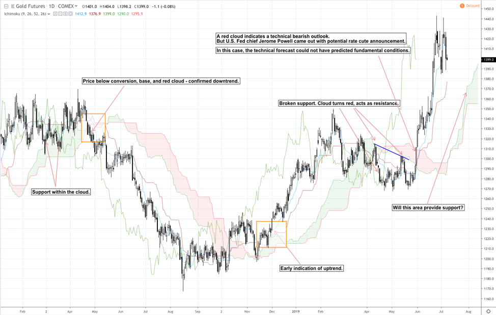
Now let’s take a look at the same chart, but this time, we’re plotting the Ichimoku cloud, comprised of five different lines (conversion line, base line, leading span 1, leading span 2, and lagging span).
Before we get into any deeper analysis, let’s simply compare the functionality and use of both indicator sets side by side.
| Functionality | Moving Averages | Ichimoku Cloud |
| Indicates trend direction | ✓ | ✓ |
| Indicates trend strength | ✓ | ✓ |
| Indicates trend change | ✓ | ✓ |
| Indicates potential support and resistance | ✓ | ✓ |
| MA crossovers can indicate potential trade signals | ✓ | ✓ |
| Price crossovers can indicate potential trade signals | ✓ | ✓ |
| Illustrates differences in short- term, medium-term, and long-term trends | ✓ | No |
| Projects future support and resistance | No | ✓ |
Despite there being a 75% commonality in function, the nuances inherent to both indicators constitute enough of a qualitative difference to casting them into separate operational realms.
Plus the functionalities that neither indicator shares–i.e. the capacity to observe short- to long-term trends in MAs and future support/resistance in the Ichimoku–comprise a huge differentiative space that further reduces their more common traits and functions.
The best way to compare the two indicators, and to better observe the difference between the way they function, is to apply them to the same set of markets.
Here’s an outline of what we’re about to do:
ONE – Analyze a market with three exponential moving averages (EMAs)
The chart above shows gold futures GC (continuous contract) from January 18, 2018, to the present (July 5, 2019). We’ve plotted three exponential moving averages: 10-day EMA to plot the short-term trend; 50-day EMA to plot the intermediate-term trend; and the 200-day EMA to plot the long-term trend.
Now let’s do something strange and keep the EMA-related comments while superimposing an Ichimoku cloud over it.
TWO – Superimpose the EMA comments but over and Ichimoku Cloud chart
The differences between the indicators will draw out a mismatch between the Ichimoku cloud chart and the original EMA comments. What’s important here is not that they’re mismatched, but how they differ with regard to interpreting past and projected price movements.
THREE – Keep the Ichimoku Cloud chart and add comments based on its indications
FOUR – Superimpose the Ichimoku-based comments over the original EMA chart
Here, you can see how the short-term EMA occasionally whipsaws around the intermediate-term EMA, often giving us a confusing signal. If we were to view these EMAs as a proxy for investor sentiment rather than the trends themselves, then such a view adds nuance to our EMA view that is specific to this particular indicator setup.
Sentiment indications are not as detailed as in the moving average combinations. Sentiment may be forecasted by means of the 26-day projection of the cloud, and a comparison of current sentiment with price 26 days back may provide a reference point, but it’s not quite the same thing as using a short-, intermediate- and long-term MA as an investor sentiment proxy.
Two traditional trend signals that are specific to this combination of moving averages are that of the bearish “Death Cross” (where the 50 crosses below the 200) and the bullish “Golden Cross” (where the 50 crosses above the 200), both of which we can clearly see on the chart. In other words, if these signals carry any weight at all for certain traders and investors, it’s likely that they will be missed on an Ichimoku-plotted chart.
Although the Death Cross and Golden Cross were missed, the Ichimoku indicated much earlier on the change in trend, hence gaining some advantage in reducing lag. Similar to the EMAs, the cloud support coincided with the 50 and 200 EMAs in March, yet unlike the 200 EMA support in May, price resistance coincided with the red cloud.
Trend strength can be assessed using just one indicator. If a moving average is moving upward in a steep manner, then we can assume that the trend is relatively strong; a flat moving average may indicate trend indecision; and a downward moving average indicates a downtrend whose strength is relative to the angle of descent.
What may be beneficial in using three moving averages is that you can see the strength of short to long term trend direction, how one may be stronger than another. When all three are moving in the same direction–as we can see happening in both directions in the chart above–then such positionality can better confirm trend strength.
Trend strength is not so much indicated by the angle of the moving average as much as the positionality of the price in relation to the conversion, base line, and cloud. This is similar to the three EMAs sailing in the same direction in consecutive order. It may appear clearer with the EMAs, but that goes with the expense of a greater lag.
The June 2019 Fed Rate Announcement Shockhappened to fall more favorably within the context of the three EMAs. How so? The 50- and 200 EMA had already signaled a Golden Cross which indicated relative long-term bullishness. So despite price bouncing off the 200-day EMA, the near-term forecast was for the price to rally from that point (which, of course, can always be broken). But to what extent was this technical reading viable, considering the unpredictable nature of the Fed announcement?
On the Ichimoku end, however, the technical bias was “bearish” in contrast to the Golden Cross. If one were to have relied on this bearish bias without considering the EMA chart, or without paying attention to the fundamental context surrounding price, one might have been taken aback quite unpleasantly by the announcement.
Last but not least, we should consider the projected support provided by the cloud itself, which extends to August 12, the price having stopped on July 5 (the last trading day at the time of writing). This feature is specific to the Ichimoku, though it may provide a better reference point than a predictive measure.
There are plenty of more differences to be found between both indicators. One market will not provide a comprehensive sample for comparison. But now that you are aware of the differences in some detail, we recommend that you continue exploring the differences between the two, especially if you are considering using one or both as a means to technically analyze the markets.

We have been trading supply and demand strategies for over ten years, and they have stood the test of time remarkably well. Supply and demand is...

3 min read
Choosing the right trading journal is essential for traders wanting to analyze performance, refine strategies, and improve consistency. In this...

3 min read
“95% of all traders fail” is the most commonly used trading related statistic around the internet. But no research paper exists that proves this...