Supply and Demand Trading in 2026
We have been trading supply and demand strategies for over ten years, and they have stood the test of time remarkably well. Supply and demand is...
This post marks the start of a new weekly category here on the Tradeciety.com website. From this week on, I will be sharing the chart of the week every Friday here on our blog. With the chart of the week, we are going to take a deep dive into chart analyses, and price action trading, using a step-by-step approach to understanding price charts.
This week, we are going to take a look at the AUD/USD. I shared this chart study in my weekly newsletter previously. If you want to be part of my weekly trading newsletter and receive one email every Thursday with brand new trading tips and the best chart studies, you can subscribe for free here: Tradeciety Newsletter
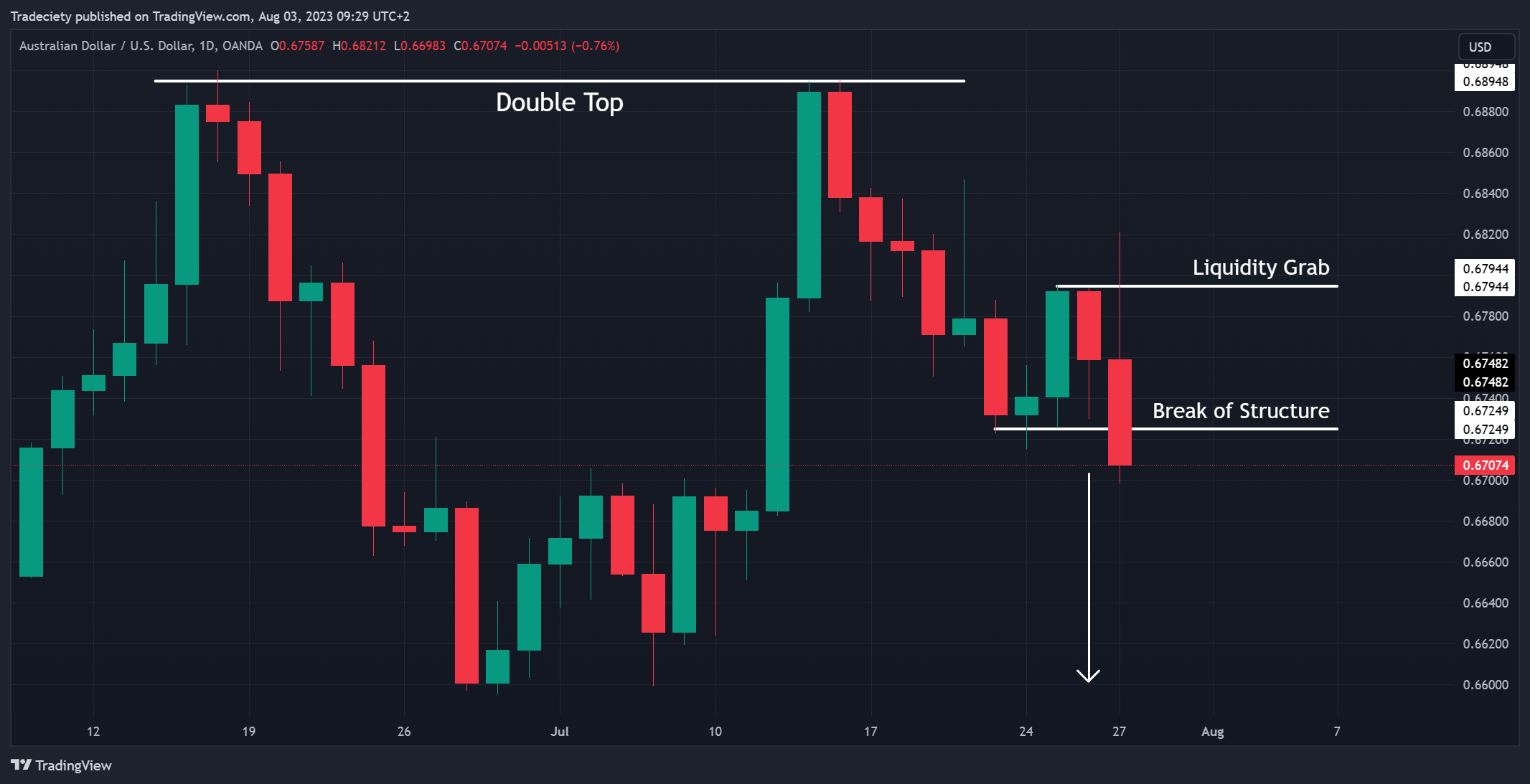
Let´s start on the higher timeframe and we can find a lot of great insights about the price action here:
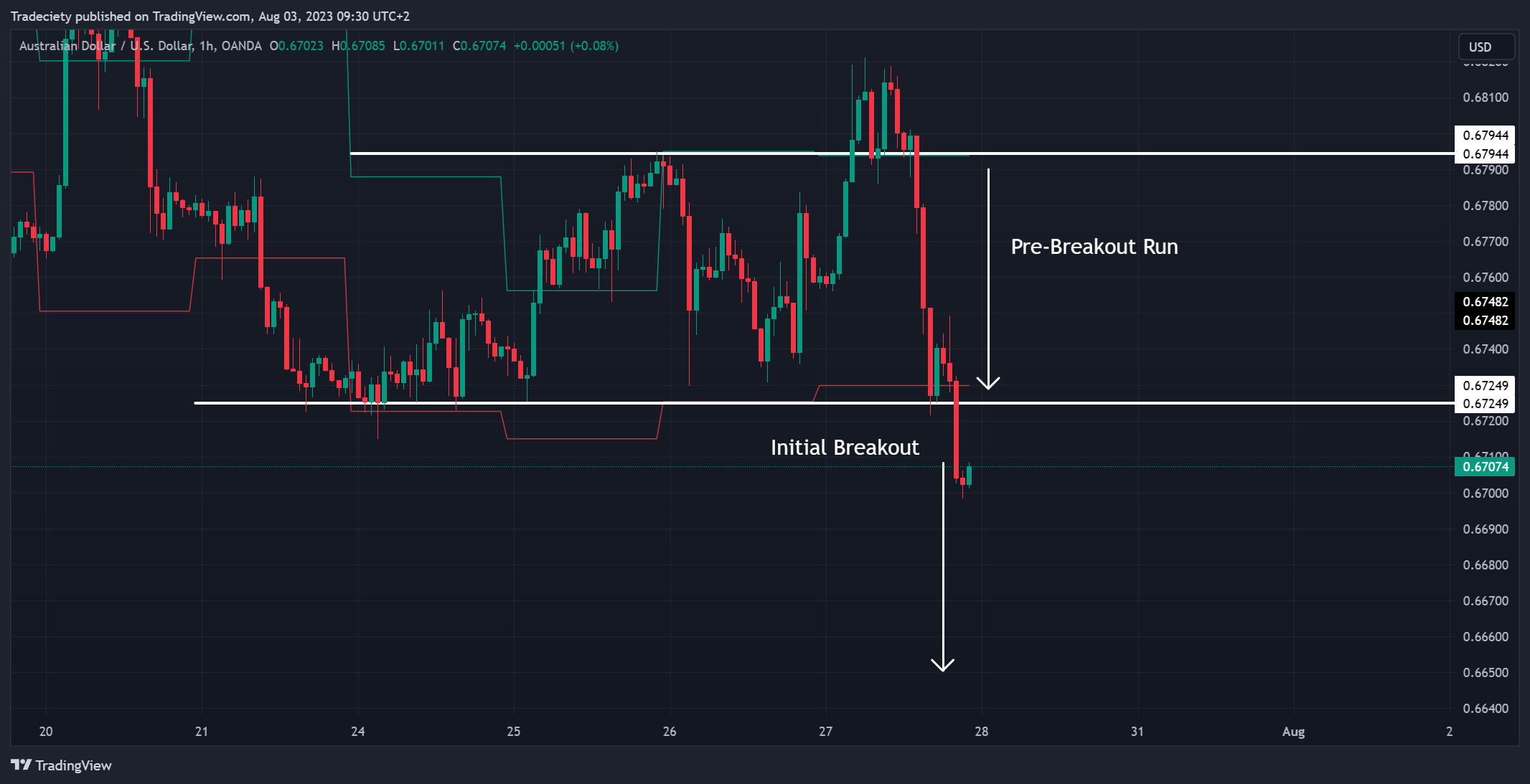
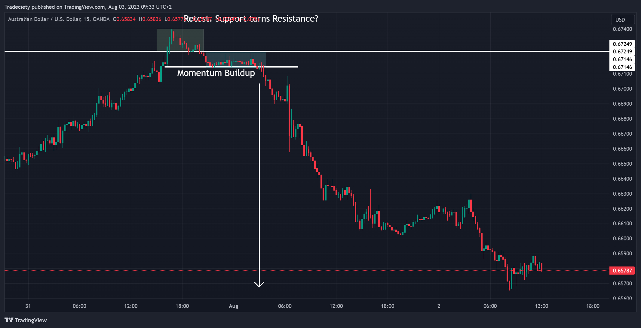
On the lower timeframe, we can see the breakout trend wave. However, one thing is important to observe here: Although there is a breakout, the pre-breakout trend wave is extremely bearish. The traders who decide to just sell the breakout at this point are chasing the price. This is generally considered bad practice. The longer a pre-breakout trend wave is going on, the higher the chance of a pullback. So the best thing here is to wait for the next signal...
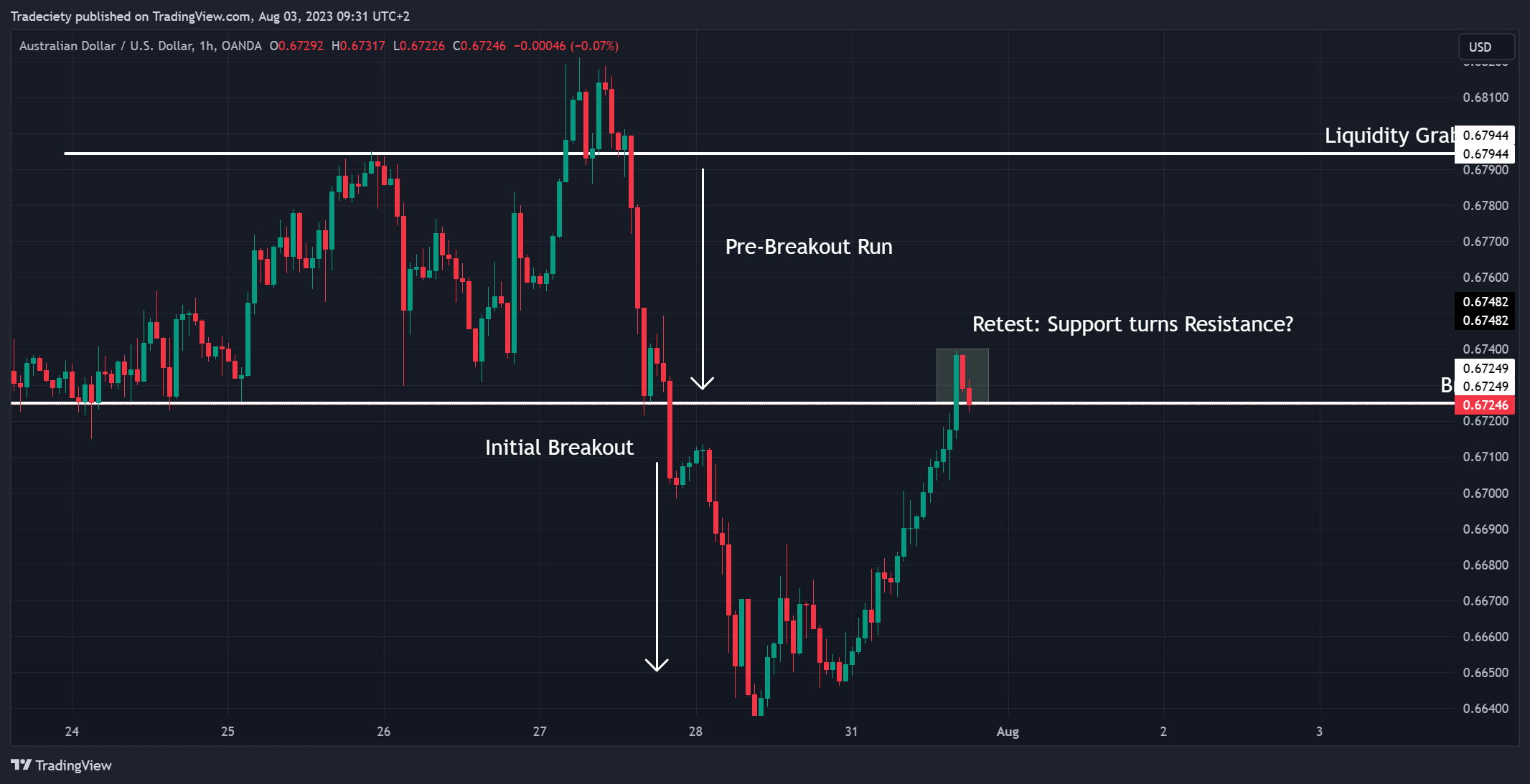
Waiting was certainly the right decision. Although, in this example, the breakout could have provided a small winner, this is not always the case and a pullback can also occur much sooner. Now, the price has arrived back at the breakout level and we can wait for support to turn into resistance. To get an even better entry signal potentially, we can go to an even lower timeframe to observe the price action there.
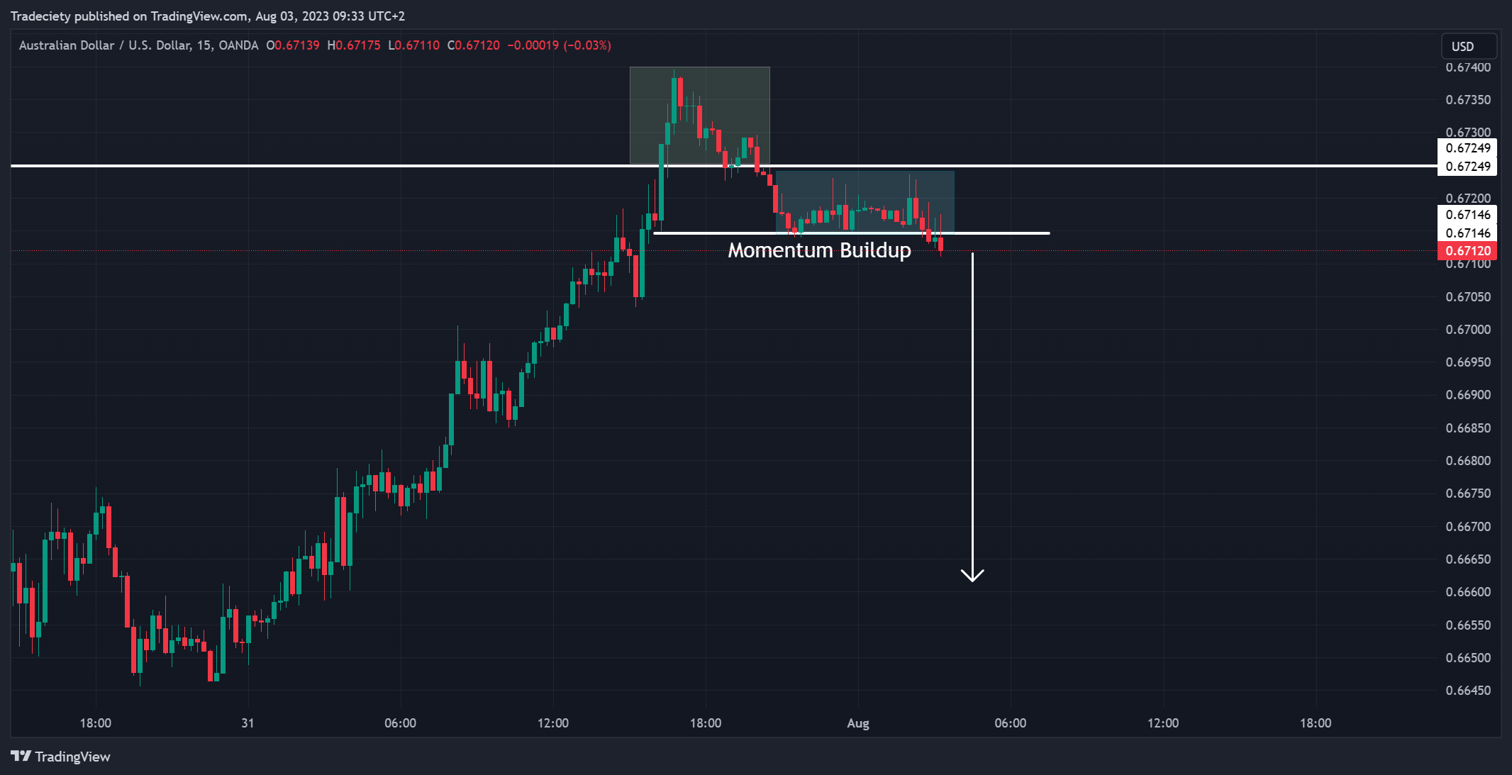
The lower timeframe shows this amazing Momentum Buildup pattern. The price has built a natural support level and is really sticking to the level. This shows that there is a lot of selling interest that is keeping the price that close to the level; the buyers cannot get the price higher from there anymore. A breakout could signal the start of the next trend wave. That way, the trader would not chase the price but enter relatively early in the new trend wave; a much better entry scenario compared to the first one above.
And voila. The final outcome. Of course, this will not work out all the time but nothing in trading works 100%. However, this top-down approach can be a great foundation for a trading strategy. I would recommend trying it on Demo or in a Backtest (no real money!) and evaluating the effectiveness for yourself.
That´s it for this week´s chart of the week. You will read again from me next week with some new trading tips and my favorite charts.

external link:

We have been trading supply and demand strategies for over ten years, and they have stood the test of time remarkably well. Supply and demand is...
3 min read
Choosing the right trading journal is essential for traders wanting to analyze performance, refine strategies, and improve consistency. In this...
3 min read
“95% of all traders fail” is the most commonly used trading related statistic around the internet. But no research paper exists that proves this...