Supply and Demand Trading in 2026
We have been trading supply and demand strategies for over ten years, and they have stood the test of time remarkably well. Supply and demand is...

Being able to understand when a trend is likely to stop and/or reverse is an important trading skill and it can help traders with exiting trades, riding trends to make more money or finding trend reversal entries as well. In this article, I will introduce 7 price patterns that you can see over and over again across markets and timeframes.
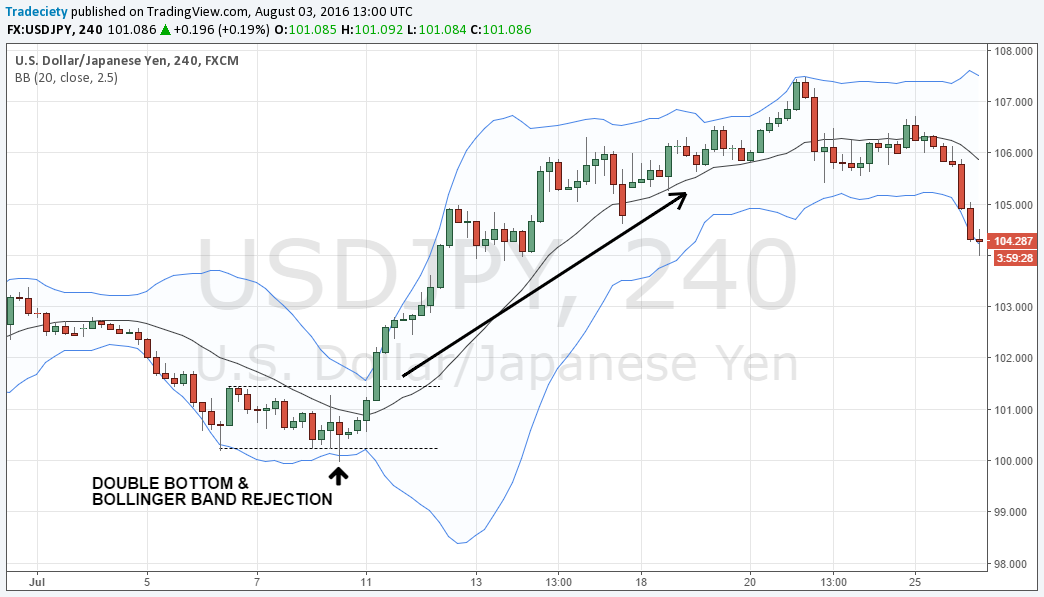
The bottom formation below is very common and after prolonged trends, you can often see consolidation periods where not much happens. The trigger that signals a new trend into the opposite direction is the spike outside of that range and the immediate rejection.
It’s a classic trap and the reversals into the opposite direction of the fake spike can be explosive. Thus, if you are in a trade and you see a rejected spike through the Bollinger Bands® (note that we use 2.5 Std Dev. Bollinger Bands®), it’s a good time to exit your trade and wait for potential reversal entries.
Read more: How to trade the Bollinger Bands® squeeze
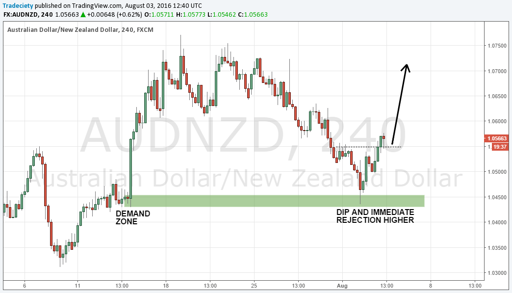
Estimating whether a price level will hold or break during a trending move is very difficult but the demand-dip shows clearly that the trend is likely to be over. In the screenshot below, price was in a strong downtrend but once price reached the demand zone marked in green, price first accelerated into the zone and then completely reversed. It’s very common to see an acceleration into a demand zone because it creates the illusion that the trend is picking up momentum, whereas the smart money is just creating a trap. The wick to the downside and the bullish candle afterward are clear signs that the trend is over.
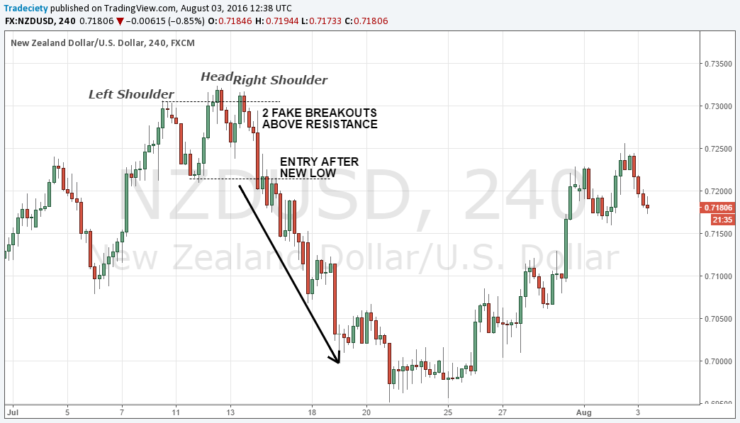
The Head and Shoulders is my absolute favorite pattern of all because it shows perfectly how the natural trend structure (higher highs or lower lows) is broken and price slowly transitions from one trend phase into the next.
The screenshot below shows that nicely and the large red candle that then broke the neckline and confirmed the new trend structure (lower highs and lower lows), was the final piece to the puzzle and the signal that momentum to the downside is picking up.
It seems such a simple pattern but it works very well and you can see the Head and Shoulders daily when it signals the rejection of a trend.
An exhaustion gap is common in stock trading or on weekly Forex charts where you can actually see gaps. In the screenshot below you can see how price gapped higher above the first dotted resistance zone and then even tried to move higher as we see with the wick. Then, suddenly, the trend completely reversed and whereas previous candles were mostly small, the large red candle at the top showed a clear change in trend sentiment.
The gap created the illusion that buyers were pushing price much higher and a lot of retail traders probably jumped on the train, just to see how they were tricked into the wrong trade.
note: the marked large red candle at the top opened at the high of the body and then closed lower, indicating the gap up to the previous small green candle.
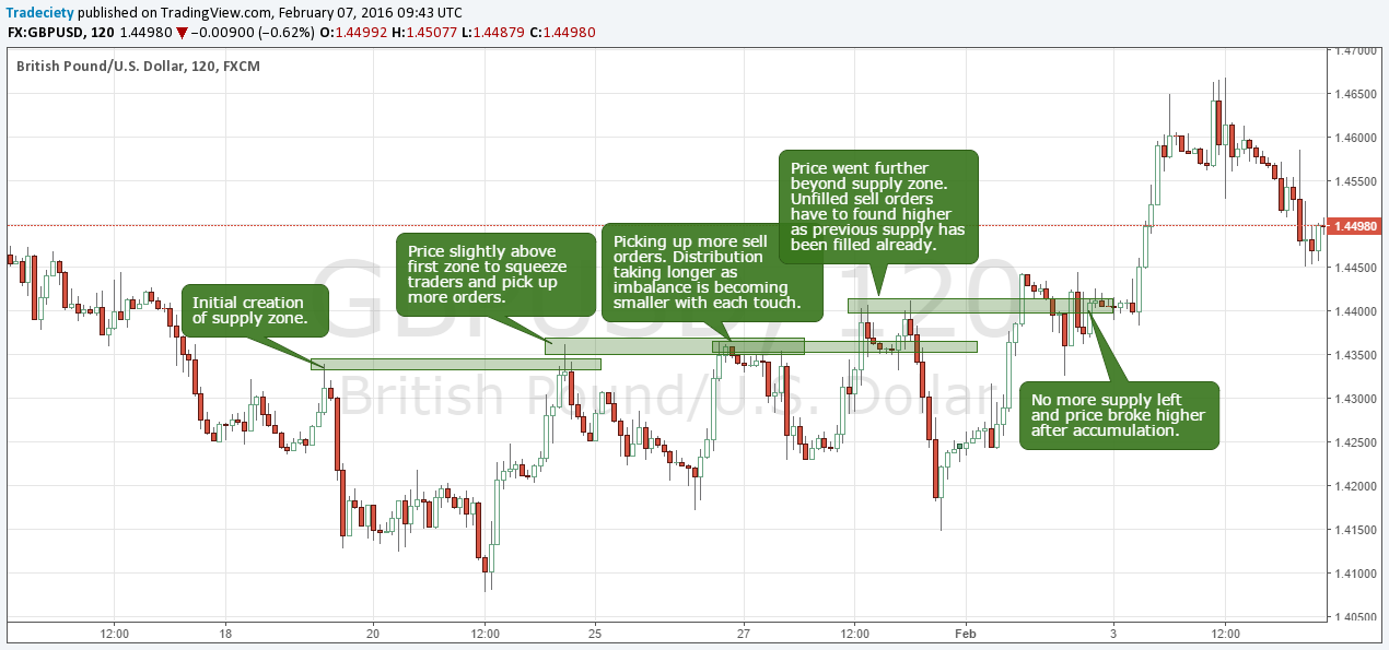
The screenshot below shows nicely how price consumes unfilled supply and how supply and demand levels can be used to identify likely turning points. On the far left, the supply zone was created after price suddenly sold-off very sharply.
The next time price rallied back into the area, it found new sellers at the very low of the supply zone and turned lower, leaving with an engulfing candle. Afterward, a new trend was started to the downside.
The next time, price went into the supply zone deeper and you can see a few more pushes into the supply zone, every time a little deeper to consume more of the sell orders and also to trigger stops above that area. The final push wasn’t as strong and it became clear that buyers weren’t able to push higher again and then price sold off. I love how charts can tell you such a story.
The support and resistance flip happens ALL THE TIME and probably every trader has heard that ‘support turns into resistance’ and vice versa. Below, you can see a great example, how price went from going higher, to then making a range top where price just consolidated and market participants were wrestling about the new direction. Once it sold off lower, into the new support, price then also retested the old support as resistance. The rejection wick that went into the new resistance was a clear sign that price is ready to move lower and that buyers aren’t strong enough to break higher. On the way down, price kept repeating this break and retest pattern and you can see such patterns across all markets. That’s why using support and resistance for your trailing stop works so well too because during a healthy trend, those levels hold while you only get kicked out of your trades when levels break.
I am a big fan of momentum candles and momentum shifts because they are a very obvious signal for the overall trend sentiment. In the screenshot below you can see how price consolidated in the range after the rally and then suddenly we saw the large red candle which did not break below the low but it clearly indicated a change in trading behavior. Momentum candles stick out and are easy to see; they signal that markets are ready to enter a new direction and start a new trend with an impulsive move. It’s important to wait for the close of such a candle to avoid running into traps although FOMO (Fear of missing out) often makes traders jump onto such candles too early.
You can see, being able to read rejection patterns is a great skill and if you learn to listen to the story price tells you, you will be able to read market structure, orderflow and buyer-seller balance much better by just using price action principles.
Further reading: The 8 price action secrets every trader should know

external link:

We have been trading supply and demand strategies for over ten years, and they have stood the test of time remarkably well. Supply and demand is...
3 min read
Choosing the right trading journal is essential for traders wanting to analyze performance, refine strategies, and improve consistency. In this...
3 min read
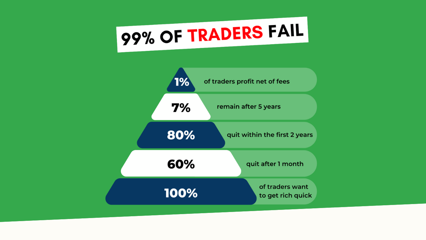
“95% of all traders fail” is the most commonly used trading related statistic around the internet. But no research paper exists that proves this...